
Sometimes we come across a beautiful redesign that really is leaps and bounds ahead of the rest of the industry, and this small airline in North Eastern Canada is by far a small diamond in the rough. Where some airlines with a small regional network can wisely invest into making sure their ageing fleet is kept flying, Air Inuit has invested money and time to create a ‘sensitive brand image’ representative of its operational environment. Designed by Canadian creative studio FEED and the lead Brand strategist Marc-André Chaput, this amazing redesign has excelled itself. We really only have ourselves to blame, (and perhaps the lack of PR presence globally) that this airline’s new design has been undiscovered for over a year now.

A full design brief has hit this airline on every single brand touchpoint from envelopes to the livery itself. Excellent elements include both an innovative, contemporary typeface by Jean-Baptiste Levée, and a thoughtful and inspired illustration by Stéphane Poirier. Both these wouldn’t feel out of place in a modern magazine such as Wallpaper or Monocle, and that said, there are elements in the design that resemble the work of Tyler Brulé or Winkreative, yet somehow, the designs for Air Inuit seem more approachable and tactile.
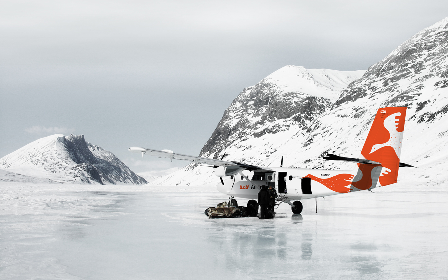
Established in 1978 with a lone, single-engine De Havilland Beaver aircraft and collectively owned by the Inuit, who have occupied the territory for thousands of years, this airline is the sole carrier providing passenger, charter, cargo, and emergency air transport services to Quebec’s northernmost coastal communities known as Nunavik. Its small fleet of 26 airplanes is well known in the airline industry for having “one of the most enviable safety records in Canada” despite the “challenging and often hostile conditions” under which it operates.
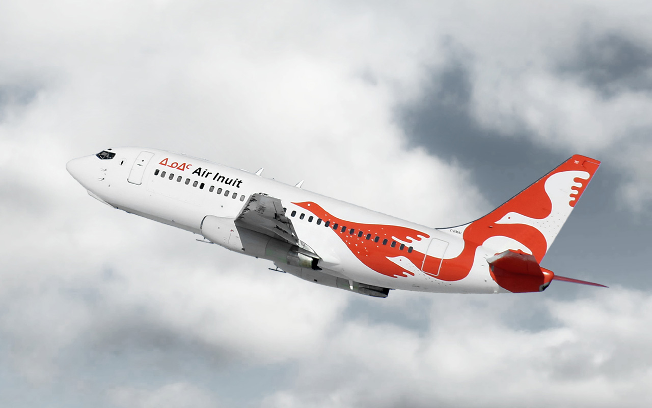
“The Escher inspired orange and white goose design was created to reflect the Inuit’s love and respect of nature and the abundant wildlife that have allowed its people to survive for millenia in one of the planet’s harshest environments. It was also intended to underscore the company’s distinctive corporate culture and bold new vision for the future; it includes improved efficiency to cope with rising operating costs, the addition of new routes and specialized services, and a careful expansion into new markets.” Says the airline on its new design. We couldn’t agree more. The goose image is a heart warming image, carefully designed to be respectful of tradition. Not only does the burnt orange look of the logo seem bright and fresh, it stands out against its environment, these planes acting as a beacon and easily visible when coming in to land. The use of colour is a nice and well conceived touch, as it reinforces the obviousness of the aircraft, something that would be anticipated before its arrival, very clearly heard and seen in these remote towns, bringing supplies and new (and old) familiar faces.
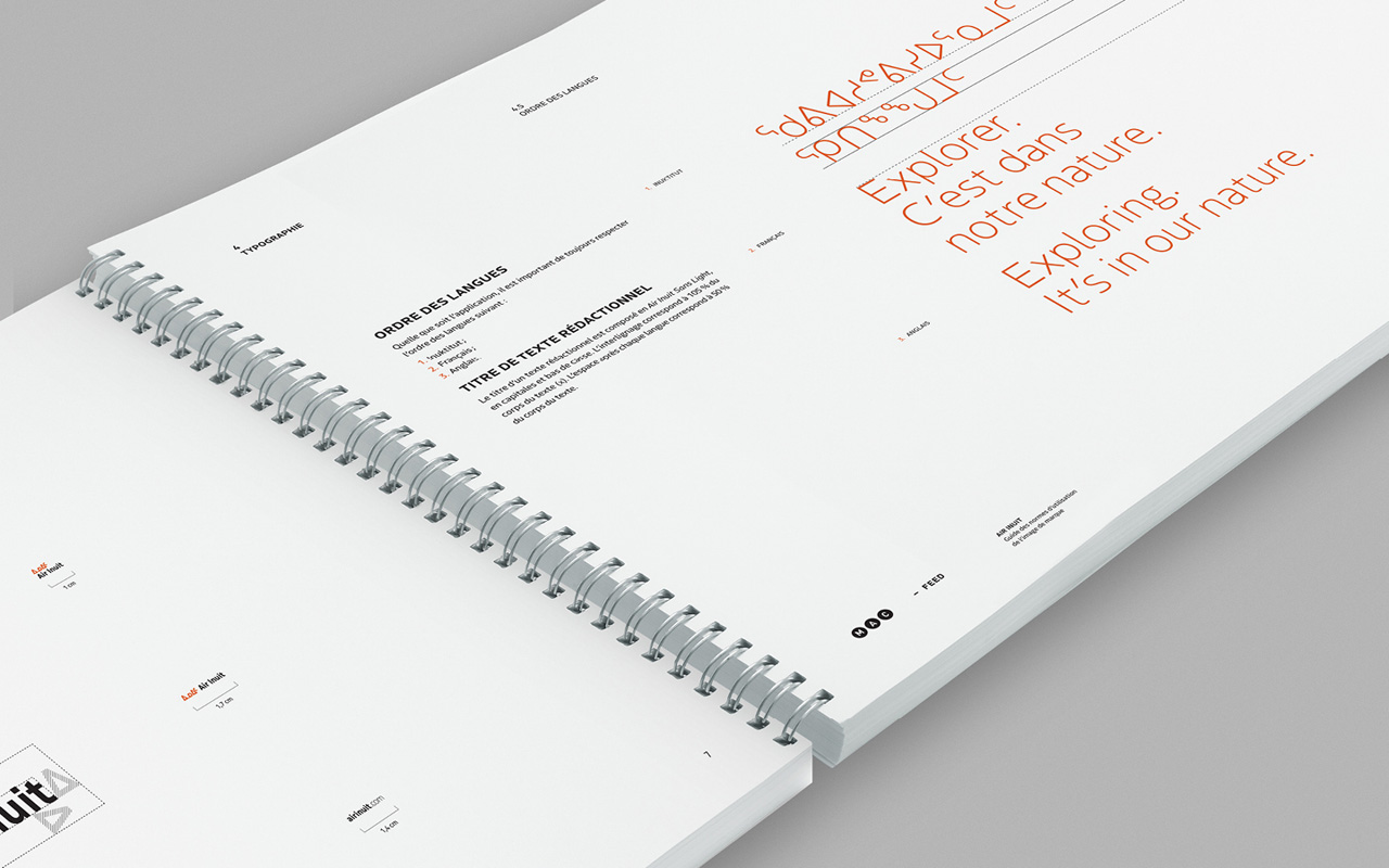
“In addition to a bold new logo and livery design, FEED also created an exclusive typeface in collaboration with French typeface designer Jean-Baptiste Levée to give the distinctive written language a strong, yet carefully crafted feel that steers clear of clichés, reflects the company’s specialized expertise and spirit of innovation, and works across cultures and languages. Appropriately named Air Inuit Sans, the corporate font is one of a handful of typefaces in the world used to write the Inuktitut language, and certainly one of the first specifically designed to give roman glyphs and their syllabic equivalent a look and feel that is common to both. The same typeface was used to create the company’s new logotype that features the word “Inuit” in traditional syllabics in orange to highlight the company’s Inuit ownership and cultural heritage.”

We salute an airline that had no need to fight off competition on these remote routes, yet decided to embrace the region with a modern and striking design, that the area could be proud of. From interiors to uniforms, to the excellence of the livery design. It may be a small fleet and a small airline, but it has big dreams, and these have been realised exceptionally well by design studio Feed and Mar-André Chaput.


Check out their website for yourselves. www.airinuit.com

Indeed an amazing rebranding!
Yep!! told them one year ago they had created a real branding little gem. Hopefully the Designair is there to save the remotly tiny airlines to merge out of the shadow. Bonne Chance to the Canadian “orange” flying gooses.
Beautifully done. Interesting, bright, creative and eye catching. Love the orange but what is it with Canadian northern carriers? Air North’s orange tails will compete with their design. Yes you see it from a distance, but there are other colours that could be used…that reference Inuit culture and northern environs.
What a fantastic look!!!