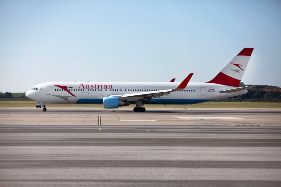
Austrian Airlines has quietly announced its new brand in respect for the recent incident with sister airline Germanwings. However, the new brand signals a big change in the Austrian carrier. Marking the fusion of both Austrian Airlines and Tyrolean on April 1, 2015, the new livery, which will be rolled out across the fleet. Dubbed the ‘Red White Red’ livery, this new look removes the sky blue elements currently flying in the fleet. No more sky blue belly or nacelles, instead, a Eurowhite fuselage and pseudo-bmi nacelle graphics which arching red swash. “Our foundation walls have been strengthened again, and now we are giving ourselves a new coat of paint”, says Austrian CEO and trained architect Jaan Albrecht.
The livery, instead of a complete redesign, still includes the same tail fin and logotype, icon and the only real addition is that of the text ‘my’ in front of the world Austrian. “The brand name ‘myAustrian’ is designed to signal to customers that we want to more effectively respond to their individual product wishes in the future than in the past. At the same time we want to strengthen the identification of our employees and customers with ’their’ airline”, says Austrian Airlines CCO Andreas Otto. Fair enough, however, we aren’t sure about the execution of the new brand image. We can explain our reasons.
Eurowhite schemes are generally frowned on by the public in Europe, being translated as a temporary design, with little innovation or creativity, and the introduction of the ‘my’ cheapens a national airline, making it feel like MyTravel, a previous leisure airline. According to a recent press release, the carrier is positioning itself towards a leisure market “Austrian Airlines plans a slight strategic shift towards focusing more on tourist destinations in its route network. The underlying reason is the trend towards more private trips, especially warm water destinations, as well as the airline’s strategy to compensate for the reduced seasonal business in the winter months.”
This may be seen as visually embracing the market they are trying to serve, they already are supported by a leisure airline, Edelweiss, whose cheap and cheerful brand image already speaks to a leisure market. Let’s compare the positioning to other tourist-destination national carriers (Fiji Airways, Air Seychelles, Air Mauritius or even Hawaiian Airlines) all of which offer a contemporary and professional image, whilst embracing the tourist market they predominantly serve.

The Servus on the bottom of the plane works well, although doesn’t translate to anyone apart from Austrian speakers, who by default, have limited options flying out of Vienna. From below (the second largest promotional area on the aircraft apart from the fuselage side/tailfin) this airline is difficult to identify, and to compound the problem, the nacelles, which still display the website, ‘austrian.com’ is a dated device, with even low cost carriers such as EasyJet moving away from using. More-so, how many destinations does this full service carrier fly to which are served by an air bridge? As most passengers will only see the aircraft from the front whilst waiting in the airport, these nacelles will be seen by very few, and the text being far too small for those seeing the aircraft fly by as it comes in to land.
The removal of the sky-blue, in our opinion is a step too bland. It was what made these aircraft identifiable from a sea of red white and well… red aircraft. In Europe, the carrier will now join the ranks of Swiss, Turkish, Air Berlin, Helvetic, Air Malta, and maybe even Iberia from a distance.
The carrier is stirring things up inside the cabin, offering a restructured fare system in their short haul routes in turn making themselves more accessible to more people. However it still is a full service airline, offering a fleet of standard offerings, including hot meals and frequent flier miles and is a family member of the Lufthansa Group with codeshare routes. The introduction of ‘My’, the emblazened ‘Austrian.com’ and the simplification of the livery design has only cheapened a national carrier, and reduced passengers expectations of what is really a very smart, and professional carrier. It’s a shame, and a very disappointing outcome considering how much we love the carrier and what its trying to do.


Yes, the old livery needed a bit of refresh, but that little touch of sky blue offered many opportunities to play with. The new livery is very professional, but a bit sterile. Austrian is my favourite “Lufthansa’s friendly small sister” 🙂
Well, nicely said about cheapening the brand and how even low-cost airlines start saying good-byes to hideous .com in their liveries. I guess Lufthansa was happy about cheapening the (whatever) competition in the brand sea.
Each time I fly this carrier I have problems of some description. Today I can’t check in on line via the OS website. Jaan Albrecht should make some real improvements to product and service before tinkering with the paint job
An awful ‘refresh’ if it can so be called one, there are rumours that this is to be changed back to something resembling the original and the ‘My’ to be dropped. Quite right too, this is abysmal for a flag carrier
I just can’t get used to the absence of the skyblue, as if the aircraft came out of the painthangar too soon, it looks unfinished and the tail logo is not strong enough to make an impact like SWISS does, the livery it now resembles, too much white, too little variation, too bland, shame because the staff and cosy atmosphere on board give a much more positive vibe to the brand!