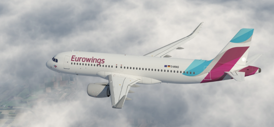
Yesterday Eurowings, which is Lufthansa’s newest LCC brand, revealed its first aircraft painted in its new livery. The new-look carrier will start by mirroring the product on offer by sister-airline germanwings. Firstly, a few facts, Eurowings isn’t a new brand. It had been operating since 1994 as a regional carrier for parent company Lufthansa. The new brand is part of Lufthansa’s recent strategy to compete with low cost carriers that dominate the European market, whilst allowing Lufthansa mainline to continue to offer a premium long-haul product.
The look may seem familiar, due to the fact the new brand aligns itself with the already-established germanwings brand, and the logo and livery design mimics the treatment that has subtle nods to parent carrier Lufthansa. However, sadly we aren’t totally in love with the new Eurowings look. Whilst we sang the praises of the new germanwings look back in 2012 for it’s clever visual connection between the letter “W,” the german flag and the vapour trails of a jet; we are struggling to understand the livery that Eurowings has opted for.
These two airlines are both owned by Lufthansa and have the ability to work off each other’s exposure and increase passenger bookings, and indirectly will, as there are similarities in brand positioning. You would be forgiven for mixing up the two brands when considering booking a flight.
Both use the word “wings”, both used rounded overlaid graphics on the tail, both have their logotype in the deep Burgundy colour and feature their logo by the nose under the flight deck windows. What is more, they will both increasingly become very familiar sites across Europe on low-cost and metro-based routes, and offer the same inflight product (at least to start with).
However, whilst there are similarities, there are also too many inconsistencies, making these two brands almost, but not quite a perfect match, and that similarity, yet disparity, grates on us, as it feels like lazy design. For example, germanwings, utilises the lowercase ‘g’ yet Eurowings uses a capital ‘E.’ germanwings utilises the same grey underbelly as Lufthansa and includes the Lufthansa Group logo, helping tying it in to the famous and respected Lufthansa brand. Also, germanwings uses the Lufthansa typeface, however Eurowings brings in a brand new typeface, that is almost but not exactly the same.
Eurowings however has also opted for a clean white fuselage, with the Eurowings logotype on the belly. Also, we cannot decipher what the tail is meant to symbolise. It doesn’t seem to indicate a W, or an E. Even the logo, located by the windows or on the belly, is three stripes and at such an angle, it doesn’t translate as a letter of any description, instead, just a logo graphic. If this is the case and it’s just a logo, why doesn’t it mirror the graphic on the tail fin?
Not all is lost though, whilst we may not understand the livery treatment, the balance of colour and form on the aircraft, is actually very well pieced together. There is a nice balance of graphical element on the aircraft, and works equally well with both A320 and A330 aircraft. Our only real design gripe is the odd location of the aircraft registration, which feels to prominent, and far too forward on the fuselage. It’s a shame though, as it had the ability to be a part of a great family of liveries, yet seems to sit alone, as the slightly stand-offish and estranged sibling of it’s older germanwings sister. Who knows, as the fleet grows, maybe the two brands will align themselves just a little bit more to make a perfect match.
We ask the question to you, which livery do you think is the most successful?


From what I understand germanwings will be absorbed into Eurowings and the germanwings brand, sadly, will disappear. Therefore, there is no need for brand alignment. I do agree though that there is just something off about the Eurowings logo and tail design. Shame.
Funnily enough, we were looking for an official comment on this, as we had heard it too, however, reading all of the official statements, it seems the ‘Wings’ brand will remain, and there is no mention of germanwings disappearing, and even if germanwings does get absorbed, the two will still work side by side for a while.
What things for sure…this is a mess. Love your work by the way!
I believe it all comes down to how close the LH group wants the brand to LH and/or Germany, based on all the issues the article raised. I don’t dislike the Eurowings version, but I am not one to keep rebranding at every turn: it indicates a bit of indecision.
Looks like a bad mesh of Germanwings and AA’s new livery. Not a strong brand mark.
Smart review. Wizz air and flynonstop (bankrupted) use the same light Burgundy as well.
Well, after the Germanwings accident (and bad publicity), I guess Eurowings is more than happy to not look like its sister.