

Love it or hate it, Instagram’s latest refresh is a reminder of just how sophisticated digital-first branding has become. But an airline brand has to do something considerably harder. It has to leave the screen and become a world that passengers can actually step inside.
The social platform has refreshed its identity with a new wordmark and an expanded typographic system, adding yet more flexibility to a brand already built around colour, gradients, motion and an ever-evolving digital environment. Whether the new Instagram is better or worse is largely subjective, and perhaps not even particularly important, albeit my view is this simply a refresh designed to bring IG top of mind again, after all, the brand is ethereal in nature beyond an icon and UI.
What is interesting is how perfectly it illustrates where contemporary branding and the hype around it, increasingly lives… on a screen.
Modern brand agencies have an extraordinary digital toolbox at their disposal. Gradients can move, typefaces can flex, logos can respond, colours can glow and identities can change according to format, audience or context. Motion, animation and sound have transformed the traditional brand guideline into something far more fluid.
For Instagram, I guess that makes perfect sense. Its product, customer experience and brand essentially occupy the same environment. But airlines don’t have that luxury.

An airline is one of the increasingly rare consumer brands that customers physically step inside. Its identity might first appear as a thumbnail on Instagram or an icon on a phone, but eventually it has to become an aircraft, an airport, a lounge, a cabin, a meal, a uniform and an interaction with another human being.
That makes airline branding a fundamentally different discipline, yet design agencies sometimes forget this important distinction. And as airlines embark on increasingly frequent brand transformations, it should perhaps change the questions they ask of the agencies they employ.
Because an airline doesn’t simply need an agency that can create a great identity. It needs one that understands how to build a world. The first requirement should therefore be deceptively simple: can the idea survive beyond the screen, a logo or a livery?

Beyond Just Logo Design
This is where many contemporary identities face their first real test. A beautiful gradient can look extraordinary on an OLED display, but what happens when it becomes carpet? What does a graphic device become when translated into the stitching of a seat? How does a colour palette behave under the wildly different lighting conditions of an aircraft cabin? What happens when typography designed for a campaign becomes airport signage that needs to be understood in seconds by somebody who doesn’t speak the local language?

For an airline, pixels eventually have to become materials. Gradients become lighting. Colour becomes fabric, carpet and ceramics. Typography becomes wayfinding. Motion becomes service choreography. Tone of voice becomes a conversation between a crew member and a passenger.
A creative agency working in aviation needs to be thinking about those translations almost from the moment it draws the first line. That doesn’t mean digital has become less important. Quite the opposite.
IATA’s 2025 Global Passenger Survey found that 78 per cent of passengers want to use a smartphone combining their digital wallet, passport and loyalty cards to book, pay and navigate their journey. Digital wallet use jumped from 20 to 28 per cent in a single year. The phone is rapidly becoming the remote control for travel.
But herein lies an obvious paradox. The more functional parts of the airline experience migrate onto increasingly similar pieces of glass, the more valuable the physical parts of the brand become. We can already see that tension within the Lufthansa Group.


There is an entirely understandable commercial logic behind sharing technology across Lufthansa, SWISS, Austrian Airlines and Brussels Airlines. Common booking technology, common digital infrastructure and increasingly harmonised customer journeys reduce duplication, lower development costs and allow functionality to be rolled out more efficiently across an enormous airline group.


Nobody should seriously argue that Austrian needs its own expensive booking engine simply in the name of brand differentiation. But efficiency creates another challenge. Simply take a look at all the group websites. When booking SWISS, Austrian and Lufthansa begins to feel increasingly familiar, where does the individuality of those brands go?
SWISS shouldn’t simply feel like Lufthansa with a white cross. Austrian shouldn’t become Lufthansa painted red. These airlines represent different cultures, histories and personalities. The answer isn’t necessarily to unwind digital consolidation. It is to make sure individuality is being protected elsewhere. And this is the biggest frustration with the roll out of Allegris. Lufthansa increasingly believes differentiation is simply skin deep.


So, if the digital architecture and hard product becomes more consistent, perhaps the lounge needs to become more distinctive, the cabin has to work harder. Food, uniforms, language, service rituals, materials, sound and lighting suddenly carry more responsibility for telling you which airline you are travelling with.
This leads to the second question airlines should ask their agency: does the brand have distinctive codes, or simply distinctive graphics? There is a marked difference. A logo is a graphic. A typeface is a graphic. A pattern is a graphic. (Designer will bang their collective heads against their Mac at the amount of times they’ve screamed about how a brand is more than a logo). A brand code is something more powerful. It is an element that can be interpreted rather than simply reproduced.

The strongest brand codes can become a colour on an aircraft, a particular material in a lounge, the shape of a piece of furniture, a service ritual or even the way a member of crew speaks. They give subsequent designers something to work with rather than something to paste onto a surface.
My challenge to any airline. Take any brand image of the passenger experience. Just for a second, remove the logo. Take the airline name off the lounge wall. Remove the logo from the headrest. Take the wordmark off the menu and hide the aircraft tail outside the window.
Could you still tell which airline you were travelling with? The very best aviation brands can pass that test, yet many in my eyes will fail. Riyadh Air provides an interesting contemporary example of an airline attempting to do exactly that, albeit perhaps at the other extreme. The airline describes itself as digitally native, yet has never interpreted that as meaning digitally contained. Its visual identity by Futurebrand has migrated aggressively into the physical world.

The lavender palette appears across aircraft and interiors. PriestmanGoode’s visual language was conceived to move between digital and physical touchpoints, with motifs subsequently appearing through cabin brand panels, textiles, lighting and other elements of the experience. It’s even in the tinted water glasses.

Then there is sound. Riyadh Air’s sonic identity was recorded at Abbey Road Studios using Saudi and international musicians and traditional instruments including oud, qanun and ney. Rather than existing simply at the end of an advert, it has been conceived to appear throughout the passenger journey, from boarding and cabin announcements to IFE and meal service, with soundscapes even changing between day and night.
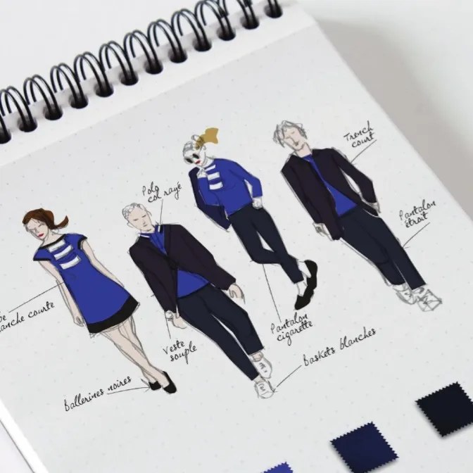
Its fashion collection, aircraft, digital products, cabin interiors and communications all inhabit recognisably related territory.
You could reasonably argue that Riyadh Air has pushed this philosophy close to its limit. There is a fine line between creating a universe and creating a theme park. Not every surface needs a motif and not every interaction needs to remind passengers of the brand strategy. But the ambition is important, especially during the launch phase of a brand.
Riyadh Air hasn’t simply asked what its brand should look like. It has asked what its brand should feel like. That should be another requirement of any agency tasked with creating an aviation brand today: can it design for senses other than sight?
Air travel is an intensely sensory experience. There is sound, texture, temperature, light, taste and smell. Yet aviation branding remains remarkably visual in its conception.

There is enormous opportunity here. A colour doesn’t always need to appear as paint; it can be expressed through light (think Virgin Atlantic or Air New Zealand). A brand associated with calm doesn’t necessarily need to shout about it; acoustics, lighting, service pace and materials can communicate it far more effectively. A brand promising warmth should be able to demonstrate that through hospitality rather than advertising.
Which brings us to perhaps the most important requirement of all: an airline agency needs to understand experience, not simply identity. Creating a beautiful airline brand is relatively easy. Creating one capable of surviving contact with an airline is considerably harder.

An identity might begin on the screen of a designer in London, New York or Dubai. It then gets handed to an aircraft cabin design agency, an architect designing a lounge, a uniform designer, a digital team, a caterer, an airport operator, an advertising agency and perhaps dozens of suppliers.
Eventually, it has to be delivered consistently by tens of thousands of employees across hundreds of airports. Sometimes all of those people are interpreting the brand simultaneously. That means the job of the lead agency cannot end with handing over a brand book containing colour values, typefaces and instructions about how much clear space should surround a logo.
The real job is orchestration, which is why I’ve championed for airline Creative Directors for over a decade. The agency or design lead needs to create an idea strong enough to survive being interpreted by other teams, while establishing enough control to ensure that the individual pieces eventually feel as though they belong to the same world.

It also means airline brands need room to breathe. Not every napkin needs a logo. Not every cabin wall needs a graphic. Not every service interaction requires a scripted piece of brand language. Indeed, confidence is often demonstrated through knowing when not to brand something.
Which leaves one final requirement: does the idea have enough depth to last? Airlines cannot rebrand at the speed of Instagram. An app can change overnight. An aircraft cabin may remain in service for a decade. A lounge can take years from concept to opening. Aircraft liveries introduced today could still be flying well into the 2030s.

That makes fashionable branding particularly dangerous in aviation. (Here’s looking at you, Joon) An identity designed around the current visual zeitgeist might look extraordinarily contemporary at launch, but airlines need systems that can evolve without requiring reinvention every few years. The best aviation identities need roots deep enough to remain recognisable while allowing the expression around them to change.

And perhaps this is the bigger lesson from Instagram’s latest refresh. It isn’t that airlines shouldn’t learn from digital brands. They absolutely should. Digital companies have transformed how we think about identity, motion, personalisation and interaction. But airlines have something most digital brands would kill for.
They have architecture. They have fashion. They have food. They have sound. They have light. They have hospitality. They have enormous moving canvases and physical spaces stretching from the airport kerb to an aircraft cabin travelling at 35,000 feet.
Above all, they have human beings delivering experiences to other human beings. Few consumer brands still have the opportunity to build a universe their customers can literally walk into. So when an airline next goes looking for a creative agency, perhaps the pitch shouldn’t begin with a logo, a livery or even an app…
Ask them to describe your world.
Discover more from TheDesignAir
Subscribe to get the latest posts sent to your email.
