
Today was the big reveal for LATAM, where new livery, full brand realisation, uniforms, airport signage and counter design were finally revealed to the public as well as a consolidated website (www.latam.com).

Everything has been perfectly timed to coincide in May, with liveries, website and even new branded magazine for the combined carriers called Vamos all launching at the same time.
“In the coming weeks, our passengers will start to experience LATAM with the ability to book tickets via the LATAM website, accumulate kilometers using LATAM’s frequent flyer program, check-in at LATAM counters, relax in LATAM VIP lounges and most significantly, fly on LATAM-branded aircraft. We will continue to optimize the most extensive route network in Latin America, the most modern fleet in the region and invest in digital solutions to offer our passengers a more personalized travel experience.” said Enrique Cueto, CEO of LATAM Airlines Group.
The new livery will first appear on a 767, which will surprise those who had seen a leaked image of a tail of a 787 a few weeks ago. The Boeing 767 will depart from Rio de Janeiro on 1 May on a one-off journey to Geneva to collect the Olympic torch. The specially prepared aircraft will then return on 3 May to Brasilia, the starting place of the Rio 2016 Olympic Torch Relay between more than 300 Brazilian cities.
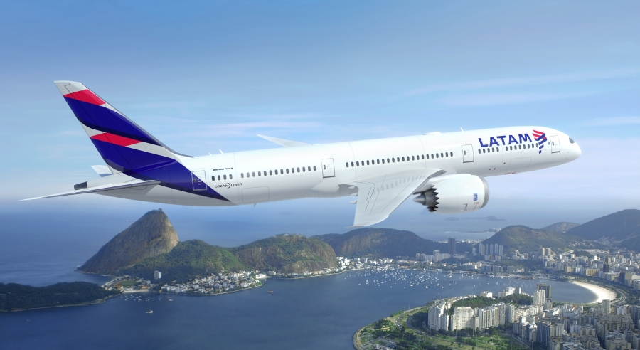
On 5 May, the first three commercial flights of aircraft with the new LATAM image will operate the following routes: São Paulo-Santiago (a Boeing 767 service departing São Paulo at 09:05 local time); Santiago-Lima (an Airbus A319 service departing Santiago at 09:10 local time); and São Paulo-Brasilia (an Airbus A319 service departing São Paulo at 14:20 local time).
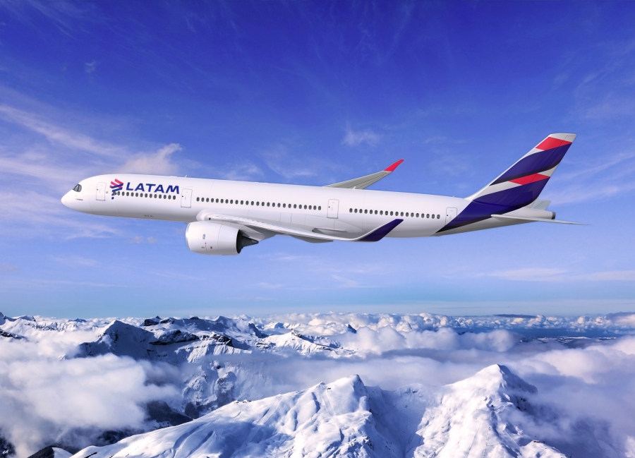
The roll out of the new brand is going to be fairly fast with more than 50 aircraft anticipated to be rebranded before the end of 2016 and the fleet-wide process is expected to be finalized in 2018.
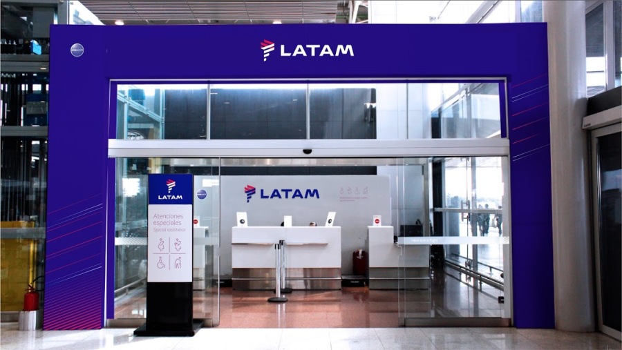
As part of the new brand roll out, LATAM’s evolution will also become visible in 13 airports from the 5th May where the group’s airlines operate including their hubs in Santiago, São Paulo (Guarulhos), Lima and Brasilia as well as Río de Janeiro (Galeão), São Paulo (Congonhas), Buenos Aires (Ezeiza), Bogotá, Quito, Miami, Madrid, Guiyaquil and New York (JFK). Changes will range from new-look check-in counters and VIP lounges to rebranded boarding passes and screen displays.
New aircraft painting technology
LATAM Airlines Group is using new technology to paint LATAM aircraft that is 25% lighter than conventional methods, which the group expects will result in an average weight reduction of 20kg per aircraft.
The painting process for each aircraft requires multiple applications of paint and Clearcoat, a new technologically-advanced gloss coating which protects against extreme temperatures and aerodynamic wear. In total, repainting takes six days – the first two days to remove the original paintwork, followed by the application of multiple coats over four days. In terms of quantity, a Boeing 787 for example, requires 300 liters of paint and 150 liters of Clearcoat.

The new Clearcoat technology, used by LATAM, will also reduce each aircraft’s impact on the environment through the weight savings. It is estimated that the new technology will achieve a reduction in the group’s CO2 emissions of 3,900 tons per year.
Our view?
We are still pretty undecided on the new livery. Both TAM and LAN had fairly strong and easily recognisable liveries. Both brands were strong and well loved across the South American Continent, which meant any livery that was going to be rolled out would receive negative feedback from those closest to the brands. LAN especially had a very beautiful livery design, that had flowing curves that managed to visually disguise the physical form of the aircraft.

Interbrands’ treatment is contemporary, strong, and easily identifiable, and as such responds well to the TAM and LAN current brand impact. However, the large white blank canvas on the fuselage and somewhat contemporary colour scheme leaves us still a little cold – for a continent so well known for their warmth and personality. We also feel the indigo-blue is too strong and powerful compared to the coral colour on the tail.

This isn’t to criticise Interbrand, the brief is tough and as such we think Interbrand we have done well, and as we have stated before, is the first time an airline has had to not only combine two strong brands, but also reflect an entire continent, rather than one country – so compromises would have to be made, and no brand response would ever be able to reflect the sensitivity of such a diverse continent.

However, for a region so passionate and so diverse, we would have hoped the brand would have evolved further than the original logo design, and injected more colour from the visual identity palette and more shape and form than a literal translation of the logo on the tail.

It’s this pure ‘perfect execution vs missed opportunity’ that leaves us a little undecided, and as American Airlines has proved to us, a united brand can be equally loved, and we very much hope that public perception of the brand warms to the new designs in equal measure, and a united South American carrier will rise from the ashes, be a truly global player, instantly recognisable from afar with a passenger’s understanding of the truly exceptional service offering offering the warmth that we feel might be lacking in the livery.
The Big Picture




British Airways called; they want their Speedmarque back.
TAM was a great livery. LAN Chile was very good! The new LATAM is just plain awful. Such a shame!
Although the new livery is quite fine but being a Latin American carrier I was Hoping to see more colour popping across the fuselage. Maybe wide rings of bright colour palette adorning the fuselage structure or something. At least they could have played with the engines I feel.
Although the new livery is quite fine but being a Latin American carrier I was Hoping to see more colour popping across the fuselage. Maybe wide rings of bright colour palette adorning the fuselage structure or something. At least they could have played with the engines I feel.
Lan had one of the best liveries in the industry, Tam had a pretty good one too. Latam’s is to me one of the worst in the industry…. Eurowhite in the worst possible way…. Nothing recognisable in the image, dull, dull dull……
I quite like the livery, especially the South American continent-inspired logo, but wish colors other than over-used red, white & blue had been chosen. The name LATAM isn’t a very attractive sounding one, but I suppose I’ll get used to it. (I got used to Etihad!) Biggest disappointment to me are the uniforms, which are just a rehash of scads of other airline uniforms from the past and are not in any way distinctive, eye-catching, or flattering.
Dull, boring, without inspiration, far from reflecting the colors and the “spirit” of South America… this trend to have a total solid white aircraft with some splash of colors on the tails is really hopeless. This new livery delivers no message… it’s, in my opinion, a total failure. This livery could apply to any country in fact. It would be perfect for a US company or a French one (blue, white, red) and does not speak for itself. I hope they did not spend much money for “that”… it’s really not worthwhile…
Well, if two countries are completely different, they are for sure Brazil and Chile. They have NOTHING in common.
But anyways, I’m not thrilled about the livery. LAN had a beautiful, elegant and very recognizable livery.
TAM livery was (in my opinion) as basic and awful as it gets.
But like many other liveries, perhaps after a few months it will start to grown on me.
When I first saw the new Latam colours in an artists impression I didn’t quite know what to make of it!! Having seen it now on a real aircraft I have say it looks very smart and the logo is very clever resembling the South American continent! The livery is growing on me and I think the 767 carries it off better than the other aircraft so far especially as they have a splash of red on the inside of the winglets. For all those people obsessed with bashing “eurowhite” colour schemes they have to get over the fact that for every airline nowadays cost is a major factor when choosing a colour scheme and liveries of old may not be economically viable today. Lastly in my opinion a white fuselage with a splash of colour (look at Garuda, Swiss and Eurowings) can look just as nice as one with a cheat line!!!
Dull, boring, uninspired. It looks like an airline, any airline. So sad that big ass clients only engage big ass branding firms for their brand identities. A small design firm would have sure delivered more fire and excitement than this.
A genuine miss in the innovation category. Generic, to fit the name.
If this ugly livery was the only mistake they made! Service is below any other airline!
tikotikosite, you mean below tico and taca?