


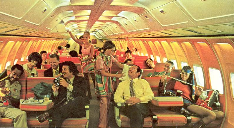
Back in the glamourous heyday of travel, airlines (believe it or not) fought for the attention of the travelers. With the recent invention of air travel, costs were relatively low. You could fairly easily get hold of a plane, fill it full of passengers and fly it to wonderful exotic destinations. OK, so it wasn’t really that simple, but the premise was the same for many start-up airlines, meaning in the 50’s and 60’s there was a wealth of airlines, vying for the attention of a customer.
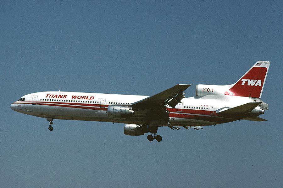
So it was natural for the airline to try and offer a point of difference, and with cabin offerings being fairly standard industry-wide this was usually implementing in their branding. But when we look back at these airlines, it’s difficult for us to see that difference. Almost all airlines (especially in the US) had simple typefaces adorning their liveries with a selection of coloured key-lines running along the fuselage, with a usually circular logo painted on the tail.

But that is because we have evolved our visual acuity with the advert of computers and developed design processes. Humans have become more adapt at understanding visual information and becoming emotionally attached to a company’s brand. Simple key-lines will no longer do (even though there has been a nostalgic nod at liveries of old – see above’s Martinair), we connect to graphics and logos like we used to Hieroglyphics, requiring more intricate detail to engage us.
How it used to be

The reason that the liveries, and advertising campaigns the airlines used to run were so basic, were do to the technological limitations that designers used to face. This was an era of Letraset and painting by eye, rather than using a detailed 3D computer model to work out a design from every angle. Even back then, airlines knew the cost of adding paint to an aircraft, with American Airlines famously opting for a polished metal airframe with simple painted stripes to reduce the weight of the frame, and inadvertently helping reflect the heat from the aircraft with it’s mirrored finish.
![]()
What this did do though, was create an epic fleet of airlines, all with a simple solution to painting aircraft. Much like lemmings, we feel most comfortable with a trend, following it with a sense of security. So it became second nature that aircraft had key-lines across their fuselage, logos became a wealth of initials, globes and wings. This became our version of ‘Eurowhite’. Design that was practical at this point. (And some purists will say that is the execution of good design)
The game changers
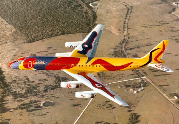
Enter Braniff in the 70’s, the best and perhaps most famous example of a movement in graphic design where people wanted to break away from the formula of design that had become mainstay. Anarchy ensued, trying to prove that design didn’t have to be so predictable and could take more inspiration from nature and other less usual avenues. Artist Calder’s liveries were some of the most radical seen in the sky.
These turns in graphic design constantly happen (and will continue to do so). Usually trends are broken by a ‘left-field’ approach to the current visual norm. Started by risk-takers that usually have a point to prove and that is ‘that they are doing things differently’ and these messages are usually timed to coincide with an advancement in technology to allow designers to use new tools not before available to them. (For designer geeks out there, I think we all remember the ability to drop shadow, or the launch of comic sans, or Flash and it’s ability to create animated websites.)
How it is now

Well, it seems we have turned full circle. Due to the financial state of the global economy, airlines have sadly gone bust, fuel prices have rocketed, and it’s created a need for practical and functional design. There is less competition, so there is less requirement for an airline to stand out (although this is still paramount). Fuel is expensive so planes must think economically with paint. Not only that white paint is lightest, but it also reflects heat, meaning less requirement to use air conditioning on the ground, which costs fuel.

I think it’s a misnomer that airlines are naturally wanting to paint their aircraft white. It’s just the fuel-saving exercise that airlines are currently going through that is the trend; the liveries are just a byproduct of this.
That is why especially for legacy carriers, where it is harder to trim costs due to staff pensions, infrastructure or cabin offerings, we are seeing more of a radical change in liveries. Only last 18 months on Thedesignair.net have we reported on the new livery of Finnair, Japan Airlines, Air New Zealand, Iberia, Avianca, American, and Royal Brunei all opting to remove as much colour from their fuselages as they can, to save on fuel burn and reduce maintenance costs, as obviously white paint doesn’t fade as quickly.
What’s the future?

As we’ve highlighted above. Design is cyclical in nature. What is now the norm, won’t remain the norm. Airlines like any competitive business will want to try to make themselves standout. As technology improves, so will the paint processes used in aviation, meaning paint will become more technologically advanced, lighter and more reflective to UV rays, and naturally build up higher resistances to fading too.
Even without an advancement in paint technology, as airline competition diminishes, variances in passenger loads become more pronounced, so the need to attract passengers becomes even more important.

Whilst LCC carriers (which by their very nature should be most cost conscious) actually understand the value of brand and invest into their liveries. When you look at the colourful liveries of the world, they can be found in LCCs such as the oldest LCC Southwest, but also Wizzair, FastJet, Kulula, Virgin America, O’hana by Hawaiian, Air Asia X, Tiger Airways and JetStar all who also make their livery pack a punch. It is with these current game changers we will see some of the biggest advancements in livery design.
Discover more from TheDesignAir
Subscribe to get the latest posts sent to your email.
A brief but interesting article. Airlines aircraft in the early 1950s and before were nearly always painted with a fairly fimple design straight onto the plane’s bare aluminimum. Was the change to ‘white roof’ colour-scheemes and later to the early all over colour scheemes (Braniff, Western etc) due to trend or painting technology?
I couldn’t agree more with Mike Z: great and interesting article, a joy to read. I’m glad there are still some carriers left with at tad more colour on their planes, but I do miss the cheatlines.
Agreed. Airlines with spectacular liveries like Air India and Aeroflot shine out (can’t say the same for their actual product). However, some airlines have managed to do wonders with eurowhite (with alterations) like Air Canada and Virgin Atlantic.
Why are liveries and uniforms so boring on so many airlines? Why are airlines afraid to take chances? you want to stand out and be seen in an innovative and respectable way. Does this mean that we as designers need to step up to the plate? Everything has to be so safe now as not to offend or scare away. Bravery has boldness to it!
Great article, straight to the point. Sobriety and minimalism (not connected with stylistic vision but costs) are some key points in today’s major companies fleets. We can observe similar trends in private aviation but dealing with others features like aircraft ownership turnover and… discretion. Most of private owners demand to land anywhere they want without any hassle. Designers have to be conscious of these facts if they want to keep on track (for the next …10 years at least? 😉
All of these ‘modern’ colour-schemes appear to merge in to one and there appears to be loses of identity. LCCs appear to favour gaudy and unappealing colour-schemes that suit their un-appealing nature. Very few, if any of the major carrier’s present schemes hail ‘Identity’, just a flash non-sense mural – in my very humble opinion!