
 It’s that time again, and the judges have voted for their Top 10 Liveries for 2014. Each year the judges sort through the best of the best to find out what is hitting the mark. This year some familiar faces return, and some get booted out of the top 10, and there are even a few new arrivals. Why do the lists change each year? It’s down to how well brands age, how current design trends effect our visual aesthetic and how well the livery is perceived by our changing judging panel. As part of our 2014 campaign, each of our Top 10’s are now rated with a clear rating out of 100, to help show how well an airline scored.
Last year’s Top 10 Liveries (2013)
10. Air Tahiti Nui
09. Porter
08. Island Air
07. Thai
06. Fastjet
05. Starflyer
04. Asiana
03. O’hana by Hawaiian
02. Hawaiian Airlines
01. Fiji Airways
Here’s this year’s Top 10.
10. Nok Air new

![]() This bright and chirpy new entrant into our list has a plethora of different liveries, all tied together with a colourful and happy beak. Nok Air is a low cost carrier based in Thailand. One of our favourites is the clown fish version. The carrier has decided to break the mould of airline liveries, offering bright and often abstract designs, which surprise and delight. What is nice to see, is the key logo concept, of ‘the beak’; cartoonish in appearance, tied together with modern typography that appears on every aircraft. It’s a breath of fresh air that hopefully makes other airlines see they can start to break away from the norm. For those wondering ‘Why the beak?’ Well, in Thai, Nok means Bird. Makes sense now!
This bright and chirpy new entrant into our list has a plethora of different liveries, all tied together with a colourful and happy beak. Nok Air is a low cost carrier based in Thailand. One of our favourites is the clown fish version. The carrier has decided to break the mould of airline liveries, offering bright and often abstract designs, which surprise and delight. What is nice to see, is the key logo concept, of ‘the beak’; cartoonish in appearance, tied together with modern typography that appears on every aircraft. It’s a breath of fresh air that hopefully makes other airlines see they can start to break away from the norm. For those wondering ‘Why the beak?’ Well, in Thai, Nok means Bird. Makes sense now!
10. Asiana -6

![]() Asiana is still sailing high on our list, three year in a row. A truly wonderful design, and even on their newly launched behemoth A380, the livery designers have managed to strike a perfect balance. The smaller Asiana logo maintains the understated and clean design concept. It truly is the height of modernity, and it’s use of grey-taupe and brighter red yellow and blues shows a unique look and feel and also gives a real sense of the airline being a luxury business player. The tail fin design resembles the petals of a flower and the overlay of colours gives the design a more delicate touch. The one thing that really shows up on this concept is the simple red arrow on the fuselage and this really counters what would otherwise feel an unbalanced and over simplified design. Simply stunning, the main reason it has dropped on our list is due to some of our newer entries.
Asiana is still sailing high on our list, three year in a row. A truly wonderful design, and even on their newly launched behemoth A380, the livery designers have managed to strike a perfect balance. The smaller Asiana logo maintains the understated and clean design concept. It truly is the height of modernity, and it’s use of grey-taupe and brighter red yellow and blues shows a unique look and feel and also gives a real sense of the airline being a luxury business player. The tail fin design resembles the petals of a flower and the overlay of colours gives the design a more delicate touch. The one thing that really shows up on this concept is the simple red arrow on the fuselage and this really counters what would otherwise feel an unbalanced and over simplified design. Simply stunning, the main reason it has dropped on our list is due to some of our newer entries.
9. Air Seychelles new

![]() Perhaps overlooked, this new Air Seychelles design has made the list this year, perhaps because it is becoming more commonly seen in the skies. Air Seychelles is actually a beautiful design. Simple, elegant and showcasing modern typography, the whole look is evenly balanced with colourful and playful swashes of colour gracing the tail fin. The new concept is a take on their older design, with elements such as their pair of Fairy Terns which have been brought into the 21st century with this bright and colourful livery. Here at thedesignair.net we feel it is important for an airline (especially a national airline) to embrace their heritage and their environment, and this is yet another prime example of an excellent and culturally sensitive brand.
Perhaps overlooked, this new Air Seychelles design has made the list this year, perhaps because it is becoming more commonly seen in the skies. Air Seychelles is actually a beautiful design. Simple, elegant and showcasing modern typography, the whole look is evenly balanced with colourful and playful swashes of colour gracing the tail fin. The new concept is a take on their older design, with elements such as their pair of Fairy Terns which have been brought into the 21st century with this bright and colourful livery. Here at thedesignair.net we feel it is important for an airline (especially a national airline) to embrace their heritage and their environment, and this is yet another prime example of an excellent and culturally sensitive brand.
8. Thai -1

![]() Thai Airways did us proud last year with the launch of the A380, and in our opinion across the whole fleet, the livery is elegant, striking, regal and proud. All the elements are effortlessly balanced, we love both the orchid design and colour palette that Thai use. It is a cleverly balanced design and sits perfectly as a larger part of the airline’s brand, the whole experience just flows effortlessly from plane to website to cutlery. We hope the airline decides to keep the livery for many years to come.
Thai Airways did us proud last year with the launch of the A380, and in our opinion across the whole fleet, the livery is elegant, striking, regal and proud. All the elements are effortlessly balanced, we love both the orchid design and colour palette that Thai use. It is a cleverly balanced design and sits perfectly as a larger part of the airline’s brand, the whole experience just flows effortlessly from plane to website to cutlery. We hope the airline decides to keep the livery for many years to come.
6. Swiss new

![]() With the wealth of ‘Eurowhite‘ aircraft dominating the skies, our judging panel has decided to bring the daddy of all modernist designs back to the top 10. A simplified and cleaner version of the original Tyler Brulé design, its clean simple look is the epitome of Swiss design, both functional and bold. The logo is in essence the national flag and nothing could be better for a national carrier. What should also be celebrated, is the maintenance of the fleet, their pristine white aircraft, constantly looking smart and clean. The airline takes design seriously too, offering a wealth of well thought through design elements, including glorious and elegant premium cabins. Well done Swiss, for showing how simple modernist design should be executed.
With the wealth of ‘Eurowhite‘ aircraft dominating the skies, our judging panel has decided to bring the daddy of all modernist designs back to the top 10. A simplified and cleaner version of the original Tyler Brulé design, its clean simple look is the epitome of Swiss design, both functional and bold. The logo is in essence the national flag and nothing could be better for a national carrier. What should also be celebrated, is the maintenance of the fleet, their pristine white aircraft, constantly looking smart and clean. The airline takes design seriously too, offering a wealth of well thought through design elements, including glorious and elegant premium cabins. Well done Swiss, for showing how simple modernist design should be executed.
6. Air Tahiti Nui +4

![]() Yes, we do still love Air Tahiti Nui‘s truly pacific livery. Three years in a row, and it’s moved up a few spots. It’s a naturally warm livery that encapsulates the natural wonders of the Pacific islands. It has clean bold lines and shapes that elegantly follow the shape of the plane whilst also incorporating more fluid and subtle elements such as the ripple on the tail or the flower motif in the tail. The striking white and blue design is fresh and always turns heads when it arrives in LAX or CDG, and has one of the best A340 liveries, we think, in the world.
Yes, we do still love Air Tahiti Nui‘s truly pacific livery. Three years in a row, and it’s moved up a few spots. It’s a naturally warm livery that encapsulates the natural wonders of the Pacific islands. It has clean bold lines and shapes that elegantly follow the shape of the plane whilst also incorporating more fluid and subtle elements such as the ripple on the tail or the flower motif in the tail. The striking white and blue design is fresh and always turns heads when it arrives in LAX or CDG, and has one of the best A340 liveries, we think, in the world.
5. Starflyer –
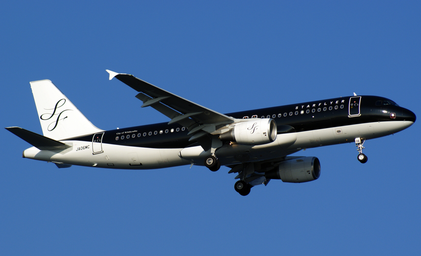
![]()
Oh no, wait, it’s not Air New Zealand’s new 787-9. Starflyer, still featuring in our list is one of the slickest and sharp liveries out there. It’s a paint-job that makes the airline look more private jet than low cost carrier. The monochromatic look is elegant, and for a Japanese Airline (think Peach) is very refined. The clever elements here are within the subtlety of the branding, especially for a low cost carrier. A clean modern typeface is under-played on the fuselage, and the SF logo on both nacelles and tailfin, are clean, elegant and refined. Whilst some carriers have historically shied away from black paintwork due to the heat effect it has on the fuselage, heating up the cabin, this airline has happily made the choice to make an impact instead. We applaud this look!
4. Air Inuit new

![]() Who? Ok, so we wouldn’t blame you, but this Escher style livery belongs to none-other than Air Inuit. Want to know more? Check out our report on their design here. This stunning livery, is stunning purely due to the environment it belongs in. This bright orange flash, against the bleak white environment of Canada where it flies to, is purely genius. The Canadian geese tessellating pattern is almost Scandinavian, and has been heralded by design critics around the world as prime example of a successful and complete branding exercise. Designed by Canadian creative studio FEED and the lead Brand strategist Marc-André Chaput, this amazing new look has excelled itself.
Who? Ok, so we wouldn’t blame you, but this Escher style livery belongs to none-other than Air Inuit. Want to know more? Check out our report on their design here. This stunning livery, is stunning purely due to the environment it belongs in. This bright orange flash, against the bleak white environment of Canada where it flies to, is purely genius. The Canadian geese tessellating pattern is almost Scandinavian, and has been heralded by design critics around the world as prime example of a successful and complete branding exercise. Designed by Canadian creative studio FEED and the lead Brand strategist Marc-André Chaput, this amazing new look has excelled itself.
3. O’hana by Hawaiian –

![]()
We fell in love with this livery when we first saw it last year. The airline has invested into its cultural heritage to create a truly inspirational and complete design. It was an artwork crafted with heart and spirit by Hawaiian Sig Zane, rather than by a branding agency, and the backstory to the livery is awe-inspiring for any designer to watch. The brand is synonymous with Hawaiian Airlines, yet has it’s own unique story and message to impart. They are just as beautiful in real life, although the aircraft registration placement still needs to be reconsidered a little, a prime example of legality destroying a design aesthetic. But that shouldn’t detract from an intelligent and well executed regional airline’s design.
2. Fiji Airways -1
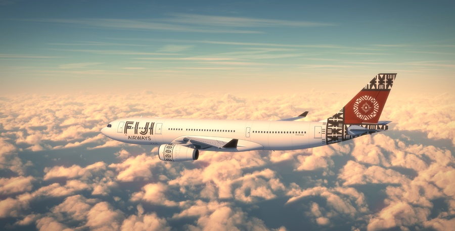
![]()
Yet again, 4 carriers from the Pacific Rim have made it into our Top 10 liveries this year, and in second place is the stunning Fiji Airways livery. In a similar story to that of O’hana by Hawaiian, this wonderful ‘heritage-bound’ national design using pacific tribal patterns and emblems show a proud cultural image that will stand out at it’s international destination airports of Sydney, Auckland, Hong Kong and Los Angeles. It appears as something still exotic, and whilst on a ‘Eurowhite fuselage’ it could have had the fate of many new liveries, and appear bland and simplistic, but it’s actually got a strong unique logotype, bold tailfin and intricately decorated nacelles, that draw the eye all over the well balanced airframe. Airlines like Fiji Airways shows that we still are producing wonderful, inspiring liveries even today.
1. Hawaiian Airways +1

![]() Placing in our Top 3 liveries for the past three years, Hawaiian Airlines has finally claimed the crown for 2014, pipping the very popular Fiji Airways to the post, who won the title last year. It certainly is the most elegant and beautiful airline liveries around. The addition of Pualani (roughly translated, Heavenly Flower) on the tail has really given it a historic and culturally connected image. However the use of the leaf motif and the bright purple and pink colours make it feel exotic and modern. The whole look sits well with the judges, who have celebrated the use of colour, design and balance. Just a mere 6 colours make up the tail design, yet provide the illusion of depth and shade. It’s great to see one of America’s best airlines take the top spot, and with many exciting developments for the airline in the future, we can’t wait to see the airline in more and more airports around the world in the years to come.
Placing in our Top 3 liveries for the past three years, Hawaiian Airlines has finally claimed the crown for 2014, pipping the very popular Fiji Airways to the post, who won the title last year. It certainly is the most elegant and beautiful airline liveries around. The addition of Pualani (roughly translated, Heavenly Flower) on the tail has really given it a historic and culturally connected image. However the use of the leaf motif and the bright purple and pink colours make it feel exotic and modern. The whole look sits well with the judges, who have celebrated the use of colour, design and balance. Just a mere 6 colours make up the tail design, yet provide the illusion of depth and shade. It’s great to see one of America’s best airlines take the top spot, and with many exciting developments for the airline in the future, we can’t wait to see the airline in more and more airports around the world in the years to come.

Where’s Air New Zeland? I think it deserves to be on top 10.
I agree 100%!
Totaly agree: AirNZ 787 All Black should be on the Top 10
YEP! Missing Air New Zealand completely. The first time I saw it at LAX I had to do a double-take!
Asiana? Really? It’s so generic. It looks like what they would use in a movie if they had to come up with an airline livery.
I agree
No problems with the number one pick but placing Air Seychelles in 9th spot is in my opinion, wrong. It deserves to be in the number 2 spot or even tied for first
Agree. Air New Zealand’s new all black livery is stunning in its simplicity and style
Air New Zealand should have been #1 easily. then Hawaiian…
Agreed, Where is NZ and even Kulula from South Africa.
Starflyer over Air New Zealand ? Rubbish.
Agree 100%
This list BLOWS
This list is an abomination. It’s missing Air New Zealand, British Airways, Aeroflot, Air Canada, Arke, China Southern to name a few.
Asiana, Swiss, Starflyer, Ohana, and Fiji don’t even beat out any of the above. I mean Starflyer? “Yep, just paint the entire thing in black and put white Starflyer on it with no artwork.” At least New Zealand put a lot of creativity in their livery design.
Etihad airways will unveil their new livery in December and I think it will be on the top of the list
This list is shit.
swiss? come on ….
How come you stole my Swiss picture without any credit?
Would love to see who these “judges” are and their backgrounds/qualifications. Talk about dull, boring and uninspired – especially when something as boring as the Swiss livery is playground beaten by Turkish Airlines, for example.
Where’s Icelandair? Sun Country? Small Planet?
Good choices…but where is Aerolineas Argentinas? Pluna had a beautiful one before it shut down.
Where is Frontier?
Asiana should have enlarged its font on the A380 – contrary to your assessment the name looks too small and weak when trying to balance against that powerful tail livery.
New LX is a total fail compared to previous LX. Also where is NZ black?
A small quibble, but I wish Asiana had placed the ‘Asiana Airlines’ logotype equidistant between the main and upper deck windows on their A-380, instead of placing it just above the main deck windows.
Air India deserves a place in the top 10. I’m sure many of you will agree!!
I’m surprised you’ve got Asiana in that list – while it’s a fine livery, I personally wouldn’t put it in any top 10 charts. 🙂 What about Sun Country?
…i fail to accept ur list…as of thai airways..which am goona sue
one day for racial discrimination…just waiting to get some good evidence…
and yes…balancing elements. excuse me..wonder what your implying..
Have you oberlooked Philippine Airlines and Air Canada? Very crisp and elegant!
Air Seychelles new livery rocks …..
I think Caribbean Airlines deserves spot on this list
yep…Air NZ should be there.The black plane is awesome
Air Newzealand livery with its all black grey and white combination is one of the best livery. Air Seychelles is one of my fav even the old Livery had its own beauty. Air Tahiti Nui livery is a beauty. Fiji airways is also lovely. the above 4 can b placed as the top 4..
Thai Airways and Nok Air. 2 from Thailand Wow!
ummm AIR NEW ZEALAND?!