So it’s probably not news to most, that LAN and TAM have been undergoing a merger process for the last three years, and most have already been naming the LAN and TAM group with the moniker LATAM in the interim whilst they investigate a new brand. However, today it was announced in São Paulo that the two carriers will merge into one new brand simply called ‘LATAM’ which will see the two older brands ceasing to exist over a three year transition period.
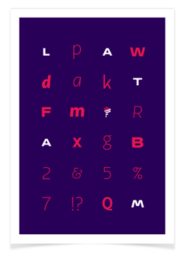
Designed by Interbrand, the new name and logo, ‘LATAM’ has been created using the blue (indigo) and red (coral) colours of both LAN and TAM to nod to the history and heritage the two carriers have, yet the new typeface and logo offer a very contemporary clean cut feel. The logo, made of dynamic ribbon lines (a little like BA’s speedmarque) resembles the South American continent, echoing the sentiment that LATAM represents the whole of South America now with a unified vision.
When describing the new logo, Jerome Cadier, VP of Marketing for LATAM Airlines Group said,“The logo was inspired by the identity and heritage of the region, incorporating the best of LAN and TAM. For this reason, we selected indigo and coral as the main colors for LATAM. The first represents the best of both worlds as it falls between red and blue which are the main brand colors for TAM and LAN. And the second, symbolizes energy and passion, essential attributes of the new brand. These two colors are supported by secondary colors that bring to life the diversity that is found in Latin America”.
“The implementation of rebranding in our industry is a gradual process and requires a long period of development. It will require a lot of time and effort, but as we work on the implementation of the new brand, we will continue to work in parallel to unify the in-flight experience offered by the LATAM Airlines Group airlines,” explained Cadier.
This has all the signature marks of an Interbrand project, and in reality there is something a little bit ‘Iberia’ here with the typeface, with slightly distorted lines and corners creating a unique signature style with a pseudo-retro touch. No surprise that the new Iberia brand is also done by the same branding agency.
This announcement is just the peak of a large rebranding iceberg, however we look forward to seeing how this simple logo and colour palette will translate into liveries, uniforms, websites and the myriad of touch points found throughout the passenger journey. We have already seen how the new brand will translate itself into the airline’s interiors both in the airline’s 787-9’s and A350’s, brought together by Priestmangoode.
Whilst this logo will obviously draw some negative press (from the purists who want to keep the LAN or TAM brands) there is something very Latin American about the new brand positioning. We recently had a trip to Brazil and Chile, and can happily state that we feel this logo embraces their locality. It’s too early to say, and even LATAM themselves stated they don’t have a full brand proposition yet, but the foundations are strong, and we cannot wait to see how this will further materialise. Stay tuned with us here at TheDesignAir and we will keep you up to date with the big journey LATAM is currently going through, including exclusive interviews with Interbrand and key decision makers at LATAM.


In the absence of any uniquely Brazilian elements to either the LATAM or GOL re-brandings, the folks at AZUL must be celebrating. There is clearly only one airline in the market that sees fit to identify with its dominant market.
I love the new uified interiors that you reported on some time ago. In fact, I think it is one of the nicest and best commercial aircraft interior design jobs I’ve ever seen. I really love it. Hopefully the new livery will match up somehow.
Emmm…. Im not sure I like this. In fact I’m sure I don’t . they pretend that the merging will be good for the company and they stipulate that unlike BA and IBERIA , Chileans and Brazilians are not loyal or attached to “their “airline ,thus, making disappear LAN and TAM won’t be hard. Knowing Chileans and Brazilians…. I have real difficulty believing what the company is saying. When I visited Chile, I noticed that they are very proud of their airline and how it has grown over the last decide. That being said it will be sad to see LANs beautiful livery.
Now the new colors don’t seem to be representative of Brazil at all. The blue doesn’t look very ” professional “. Both ” ex” logos seem much more professional than latam’s one.
Anyhow interior seems nice but overall I don’t like the idea of a unified liver. BA /IB or KLM/AF s approach seemed more appropriate.