

Alaska Airlines revealed a brand new look to an airline brand that has remained virtually unchanged for 25 years. The new refreshed look comes a couple of years after the airline refreshed it’s iconic wordmark to make it more legible, removing the strikethrough that the letter K created. The new brand was launched in a maintenance hangar in SeaTac where a new 737-800 was revealed in the new brand.

Beginning today, and throughout the rest of 2016, passengers and staff will see the visual updates in new signage at the airport, an all-new airplane paint job, a refreshed website and mobile app, as well as a full suite of other touch-points.

What is interesting to see is how the new brand came to life. “We’ve always been a company about genuine, caring service. Our values are staying the same, but it’s time for our brand to show up bigger,” says Sangita Woerner, Alaska’s vice president of marketing. “We’ve added 90 new markets in the past five years. As we continue to grow, we are updating the outward expression of our brand so it shows up bolder wherever we fly.”
“Our brand is our reputation and who we are as a company. The logo and identity, those are the outward expression of our strong commitment to our customers,” said Woerner.
But the brand shift seems to come up with an unexpected result. “Our goal was to bring more energy to the brand, so we brought color that represents the places we fly and our home here in the Pacific Northwest,” said Woerner. “We’re a brand that’s all about brightening your day, so we added some complementary blues and green to reflect that in our outward appearance.”
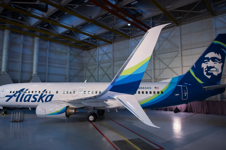
So whilst the carrier decided to name their new palette with colours such as “tropical green” for Hawai’i and Costa Rica and Alaska’s many international Mileage Plan destinations, and a palate of soothing blues: “breeze, midnight, atlas and calm.” the end result has been ribbon-like waves of colour that resemble the Northern Lights, something as synonymous with Alaska as the Eskimo on the tail itself.

When it comes to the livery, we love the balance found on the aircraft. The tail design is equally balanced by a bold (and enlarged) wordmark. The Logo typeface itself has been simplified, making it bolder and more contemporary, whilst maintaining the unique hand drawn character that became an iconic part of the brand over the past quarter-century.
The Eskimo on the tail has also been simplified, partly due to the brand now living in the digital age. Alaska states “The Eskimo of the 1990s was too detailed to render well online and on mobile devices. The team smoothed and simplified his features and expanded his ruff to include pops of colour.”

The addition to the ribbons of colour on both nacelles and winglets, along with grey underbelly mean that the aircraft are nicely balanced and Alaska has refrained from the simple Eurowhite design that many other carriers have opted to follow with their latest liveries.
“[The changes are] subtle,” said Alutiiq artist Alvin Amason, who shares a studio with Eaton and was also consulted by Alaska Airlines. “You haven’t revamped it – you’ve made it ‘today’.”

In focus groups before the brand updates, fliers unfamiliar with Alaska described its look as “corporate, functional and a bit cold.” The simple changes of streamlining the “icicle font” in the wordmark and adding green began to dramatically change people’s first impressions of the brand.
“This sets us up for future growth,” Woerner said. “We’re a fiercely independent company, and we’re updating our brand to take us into the future.” Horizon fans will be pleased to know the Horizon brand will follow suit in 2016 too.
Well done Alaska for creating a modern, contemporary refresh whilst remaining true to the original brand. Sometimes a gentle nudge forward is all that is needed to bring life back to a brand.

“…we added some complimentary blues and green to reflect that in our outward appearance.” Mmmm. Hopefully Alaska’s service isn’t as sloppy as its spelling. *complementary*
Nothing wrong with that spelling.
com·ple·men·ta·ry
ˌkämpləˈment(ə)rē/
adjective
1.combining in such a way as to enhance or emphasize the qualities of each other or another.
Blue and green are not complementary colors. 😐
Having said that, Alaska’s service is usually pretty good. It’s one of the better domestic airlines, imho.
Because they don’t mean complementary colours in the colour theory sense; they mean it’s complementary, as in they complete each other. Like how a good wine complements a good meal. The audience isn’t technical, so the descriptions aren’t written that way.
Hmm… I am not a huge fan. I have been doing a lot of consulting projects in school this fall and think that it is imperative to step way back when you are evaluating a brand. To me, the bigger issue with the company is the name “Alaska Airlines.” They have maybe a dozen routes from their focus city in anchorage. But, the huge majority of their flights are from Seattle, LA, Bay Area, Hawaii, and Mexico. Most of their flights and customers neither originate or end in Alaska. It seems weird to book a flight from San Diego to Hawaii on ALASKA Airlines. The name “Alaska” must alienate and confuse a lot of potential customers.
I do realize how beloved their name is by some, though. I think most Alaskans are, by nature, very independent and are distrusting of a larger corporate carrier and reluctant to rely on American, Delta, or United for a long-term commitment to serving remote parts of Alaska. They take great pride in having their own airline and because of Alaska Airlines, feel as though there will always be reliable air service in to small cities, no matter what happens to oil prices or other changes in the economics of flying. So, I think Alaska should spin off their intra-Alaska operations into a wholly owned subsidiary. That operation would retain the name “Alaska.” Then, they should rename the rest of the airline something to do with the West Coast.
Name aside, the new livery isn’t great either. It looks like a package of Cascade dishwasher pods or mint chewing gum. The color palette and generic swishes remind me of a cleaning product or pre-made powerpoint theme. I think they should have adapted some patterns or textures from indigenous Alaskan art similar to what Fiji did. Or… they should have done a white airplane with intricate metallic pattern over the whole fuselage so the plane looks like a glistening, snowy Alaskan landscape from a distance and has great detail up close. To get a better idea of what I mean, imagine the British Airways 2012 Dove Livery, but with metallic silver instead of gold. Retain the Eskimo on the tail as well.
I also question the font choice for the word mark. I know it is an evolution of the old word mark. But, what is the meaning of that old word mark. Why did that stenciled look best convey Alaska? To me, it just seems really random. Recognizable, but still-random. I think that just because a look is iconic does not necessarily mean that it makes sense. I, again, would have investigated traditional Alaskan art and penmanship and come up with a word mark that symbolizes Alaska.
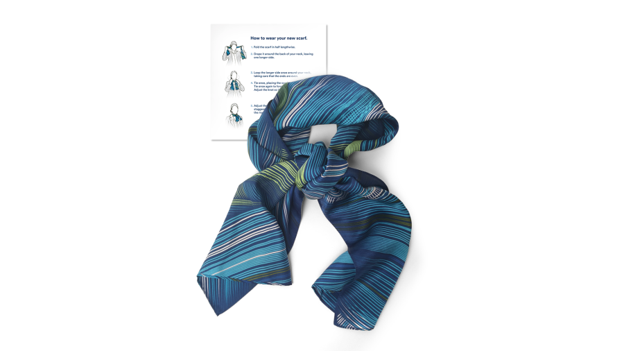
I’m not at all fond of this ‘refreshed’ livery, which I think is generic and rather banal. I liked the old wordmark, with the letter ‘k’ strikethrough. It had an edgy quality to it, and having traveled monthly between California and Alaska for 18 years, ‘edgy’ is an adjective I’d readily use to describe this beautiful, rugged and unique state. The addition of the ‘tropical’ (pea?) green seems an attempt to be all things to all passengers. (“We may be called Alaska, but we fly to the tropics too!”) And really, could that uniform scarf be any uglier?
I agree with NOT A FAN that ALASKA Airlines is too regional a name. Definitely keep that name for regional services and rebrand under a more universal name. The new livery is better than the previous one…I do like the ‘Cascadian’ colours as it does convey the colour palette of the Pacific Northwest (where I am from). The streamlined ‘Chester’ image is nice, but why on a dark tail? He kind of gets navy-ed out if not for the multi-coloured halo. Part of me wishes that the navy part was on the front end of the plane and that the ALASKA name is in white instead of blue. But…I still dream of the other ‘Heritage Alaska’ theme images from the early 70’s…the totem, the sourdough and the Russian domed church.
While it’s better than their old livery, this reminds me of two things. Copying the color scheme of the 2010 Vancouver Winter Olympic Games while copying Hawaiian Airlines at the same time. Not super original at all.
I don’t know why but I happen to love the new livery a lot as compared to their older one. The tropical green looks refreshing and the muted blue is quite a delight. Makes me want to jump on that plane and I look forward to their refreshed interiors. Keep up alaska airlines.
Not bad at all