

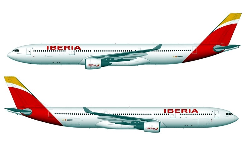
When I first saw the post from Skyliners that there was a reveal of the new Iberia livery, I was hoping that it was just a mis-identified livery from some budding flight sim enthusiast. However, on notice that there was a physical photograph of the livery in work, my heart sank. Iberia in my opinion had one of the boldest and brightest liveries in Europe. It’s strong colour palette and bold retro lines on the jet were soon going to become a classic livery. Easily identifiable and on aircraft like the A340, those lines along the fuselage lasted forever.

Then comes this new livery, which although is still speculation, is pretty guaranteed to appear on the aircraft, I felt that we had another American Airlines situation, all the same rules apply, main typography on the fuselage, pointless and unidentifiable tail. It seems there is becoming a wave of these designs that really are just uninspiring. Some Hispanic liveries are some of the best in the world, Vueling has a very contemporary livery, then look at Avianca or Mexicana, again, stunning, bold and contemporary. Whilst Iberia did have a dated livery, it was with that there was a nostalgic charm. The national airline of the homeland was steadfast and iconic. This just feels like any other livery that will last only 10 years and then have a redesign.
Why is it happening?
It seems to be a sign of the times, many airlines looking at a new livery to refresh a tired brand, rather than really concentrating on the brand itself. Such re-brands as American make me think, are they going to put as much time and training into their cabin crew? Will the cabin crew age ever come down? Will the in-flight products really change across the board quickly, or will we continue to have mismatched entertainment offerings dependant on route or airframe. Or is the company so embroiled in red tape the only thing that no one really has any protection over any more is the logo or aircraft’s paint scheme. This is the only place new management can quickly make any real changes with little interference by any unions. What’s more, management are obviously under pressure to do things cheaply, so no real care, time or money is put into the design. Is this going to be the fate of airlines to come? Superficial changes as the archaic mammoth airlines continue to swallow money wrapped up in pension schemes. It is a shame, as whilst some liveries need to be changed, others do not. Iberia, American, were both liveries that were so established, they never really needed to be changed.
In counter to this point. Look at sister company to Iberia, BA, for example, whilst the only significant change has been to reapply the ‘To Fly. To serve.” crest onto their aircraft, they have been investing heavily into product and training their cabin crew. New initiatives have been put in place in the past few years, such as mixed fleet, generating interest from a younger fresher set of cabin crew who are more enthusiastic, and the service is getting better. In my opinion, airlines should at this point go, “Ok. We have a new airline on the inside, let’s reflect that on the outside” Otherwise, sadly speaking, the change, is only skin deep.
Discover more from TheDesignAir
Subscribe to get the latest posts sent to your email.
Bland, boring and totally meaningless. Ironic: it’s almost a portrait of their current shape (and product). I spot an alarming trend of airlines choosing to put some kind of random design on their aircraft tails and their ‘brand’ on the fuselage. Nowadays it’s almost impossible to recognize an airline from their tail. I hope BA can turn this ‘mess’ into the great airline what it used to be
I really love your blog.. Only just came across it tonight for the first time, but I am disappointed by your blatant ageist remarks re cabin crew. You really seem to indiscriminately think that younger is better…. Well I can tell you, that is not always necessarily the case.
I hope you can be a little more balanced in your comments in regards to this issue.
It is surprising that BA did not exercise successful quality control on this exercise : the result is unfortunate .
It is such a shame the bean counters now control everything. Iberia are going to lose their identity with this plain, boring scheme. I wonder – Do any of the management look at the views of the travelling public? There is nothing about this that makes me think of sun, sea and wonderful holidays let alone wanting to book with them… sad!
It has been finally revealed officially.
Boooring.
It looks like hamburger wrapping paper rather than an airline livery