For the past decade, airline branding has been pulled relentlessly towards the screen. Logos flattened. Colour palettes softened. Typography simplified until it almost disappears. All in the name of being digital-first, mobile-friendly and scalable. But somewhere along the way, something vital has been lost.
In the race to optimise brands for apps, websites and social feeds, airlines have made themselves increasingly replicable. Even yet-to-fly-passengers Riyadh Air proudly states its digital ambitions. Strip away the flourishes, the quirks, the tactile details, and what remains is a sea of competent sameness. Another clean sans-serif. Another calming blue. Another abstract promise of premium. Other industries have already learned the hard way that simplification has limits.

When Burberry removed its equestrian knight in favour of a stark wordmark, it achieved digital clarity but sacrificed emotional depth. Customers did not just miss the logo, they missed what it stood for. The eventual reintroduction of a modernised knight and richer typographic language was an acknowledgement that heritage, symbolism and physical cues still matter, even in a digital age.
Airlines now face an even more complex challenge. Just imagine launching your own carrier today (if you were foolish enough to do so). You are sourcing from the same global supply chains as everyone else. The same seat manufacturers. The same amenity kit suppliers. The same lighting systems. Even colours, once fiercely defended territory, feel largely claimed. The physical building blocks of aviation have become increasingly standardised.


So how do you stand out? Not through digital polish alone – after all who picks an airline purely based on their digital experience? And not through branding systems designed primarily to live inside an app icon.
Automotive brands offer a useful parallel. When Volkswagen simplified its logo to signal a digital and electric future, it quickly realised that a flatter mark could not carry the emotional weight of the brand. The response was not to undo the simplification, but to shift emphasis elsewhere. Distinctive light signatures. Audible cues. Interior tactility. Movement and presence. Identity migrated from the logo into the physical experience. The same logic applies in aviation.

Take the contrast between airlines that have leaned heavily into digital efficiency and those that continue to invest in physical storytelling. Ryanair is unapologetically digital-first, transactional and function-led. Its app, pricing logic and operational clarity are the brand. That works because the promise is clear and the emotional ambition is deliberately low. But when full-service airlines follow the same path, the cracks begin to show.

At the other end of the spectrum, Emirates has consistently understood that its brand lives in physical theatre. The scale of its cabins. The tactility and recognisability of materials. The choreography of service. The familiar tone of voice onboard. Even the ambient soundscape and scent cues play a role. Emirates’ digital ecosystem supports the journey, but it does not define the brand. The memory is built in the cabin, in the lounge, and in the service moments in between. This is where many airlines are currently mis-stepping.

In an effort to modernise, airlines are at the simplification precipice of their visual identities – just look at the recent Korean brand refresh – as they rationalise their service language, and over-index on digital touchpoints. The result is efficiency, but at the expense of distinctiveness. Cabins become interchangeable. Lounges prioritise function over feeling. Service scripts become polite but anonymous.
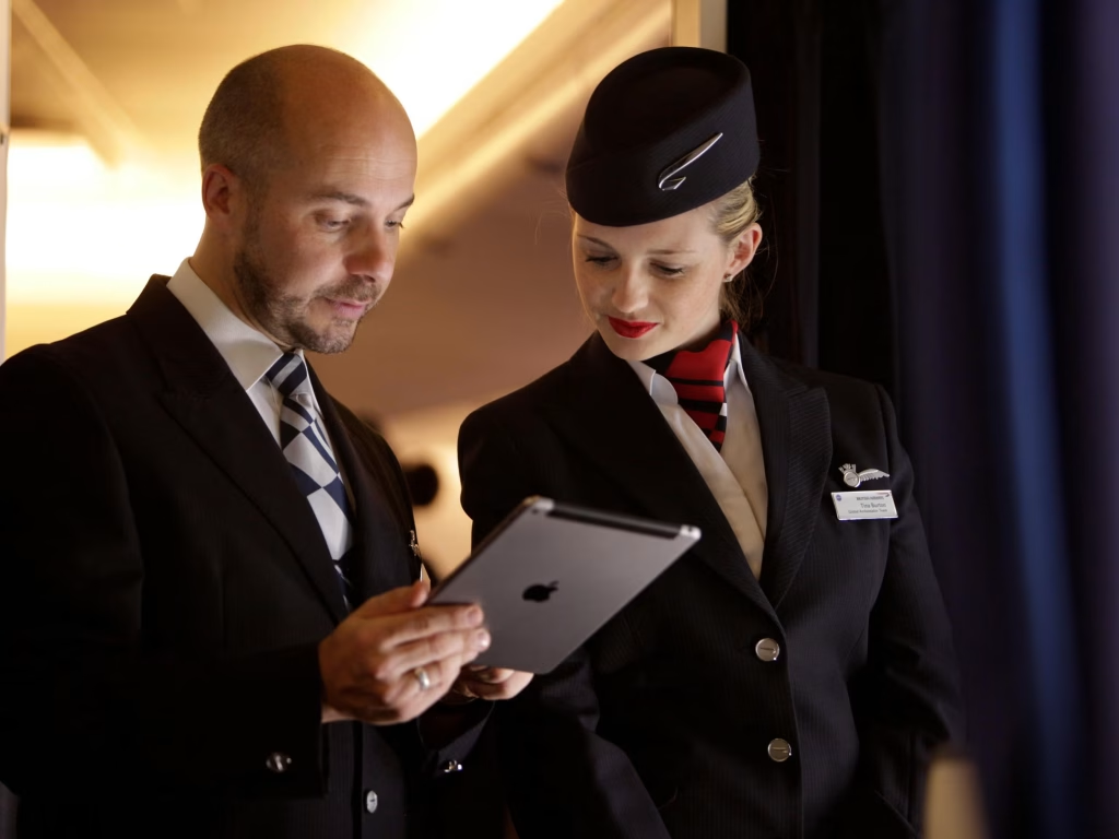
Yet service remains the most under-leveraged branding tool in aviation. When seats look familiar and interfaces behave predictably, the human moments become the differentiator. How a crew member adapts their language. How a welcome is framed. How disruption is handled. How small rituals are delivered consistently and with intent. These are not operational details. They are brand expression in its most powerful form.

Even digitally native brands have reached the same conclusion. Airbnb built its success on a minimal, hyper-flexible digital identity. But meaning did not come from the logo. It came from physical spaces, human hosts, tactile welcome materials, local rituals and storytelling rooted in place. Airbnb did not abandon digital simplicity. It layered it with physical and emotional depth.

This is the essence of phygital. Digital still plays a crucial role. It reduces friction. It removes anxiety. It helps passengers feel informed, prepared and in control. But it should not be the instrument that shapes the brand itself. The digital ecosystem should support the physical experience, not dictate it. The strongest airline brands of the future will not be built app-first. They will be built human-first, with digital acting quietly in the background.

If an airline truly wants to stand out, it must double down on what makes it different. Its culture. Its people. Its rituals. Its stories. The way those stories are told through space, service, sound, scent and gesture. Because brands are not remembered through interfaces alone. They are remembered through moments. And in aviation, the moments that matter most are still overwhelmingly physical.
As I do every year, I ask on your kind support to keep things going. If you are able to donate – whatever amount – it all gets funnelled back in to the site, to keep the site full of content. And I thank you personally for your kind support.
Discover more from TheDesignAir
Subscribe to get the latest posts sent to your email.


