
 This month we are turning our eyes to the outside of the aircraft. Usually bright and colorful, these calling cards fill international airports with a myriad of designs. A livery, if designed correctly, can convey the brand experience that takes place inside. Each year, our judges (including some new faces) sort through the best of the best to find out what is hitting the mark and ticking the right boxes for 2015. This year, some familiar liveries return, and some get booted out of the top 10, being replaced by new arrivals. Some may ask: why do the lists change each year? It’s down to how well brands age, how current design trends affect our visual aesthetic and how well the livery is perceived by our changing judging panel.
10. [joint] Air Canada [new]

![]() Air Canada‘s 2004 design by FutureBrand creeps into our list this year, proving how the livery has stood the test of time. With an iridescent paint that covers the fuselage and the world famous Air Canada red ‘Frosted Leaf’, these iconic planes have a simple understated style that may go unnoticed by most. But there is something effortless about how the carrier has managed to portray itself with its very complicated paint scheme. The color palette used embodies the nature of Canada: Canadian Red, Silver Sky, Forest Mist, Maple Red, Pacific Blue and Arctic Green. The offset screen print element on the tail speaks to the graphic designers in the judging panel.
Air Canada‘s 2004 design by FutureBrand creeps into our list this year, proving how the livery has stood the test of time. With an iridescent paint that covers the fuselage and the world famous Air Canada red ‘Frosted Leaf’, these iconic planes have a simple understated style that may go unnoticed by most. But there is something effortless about how the carrier has managed to portray itself with its very complicated paint scheme. The color palette used embodies the nature of Canada: Canadian Red, Silver Sky, Forest Mist, Maple Red, Pacific Blue and Arctic Green. The offset screen print element on the tail speaks to the graphic designers in the judging panel.
10. [joint] KLM [new]

![]() KLM has recently refreshed its livery, which had remained mainly unchanged for a few decades. The longevity of the previous livery, along with the iconic duotone blue and white color-blocked fuselages, makes this new entry into our list easily identifiable around the world. The recent change, dropping the cheat line around the front of the aircraft, has added a touch of modernity to an otherwise timeless fleet.
KLM has recently refreshed its livery, which had remained mainly unchanged for a few decades. The longevity of the previous livery, along with the iconic duotone blue and white color-blocked fuselages, makes this new entry into our list easily identifiable around the world. The recent change, dropping the cheat line around the front of the aircraft, has added a touch of modernity to an otherwise timeless fleet.
10. [joint] Qatar [new]
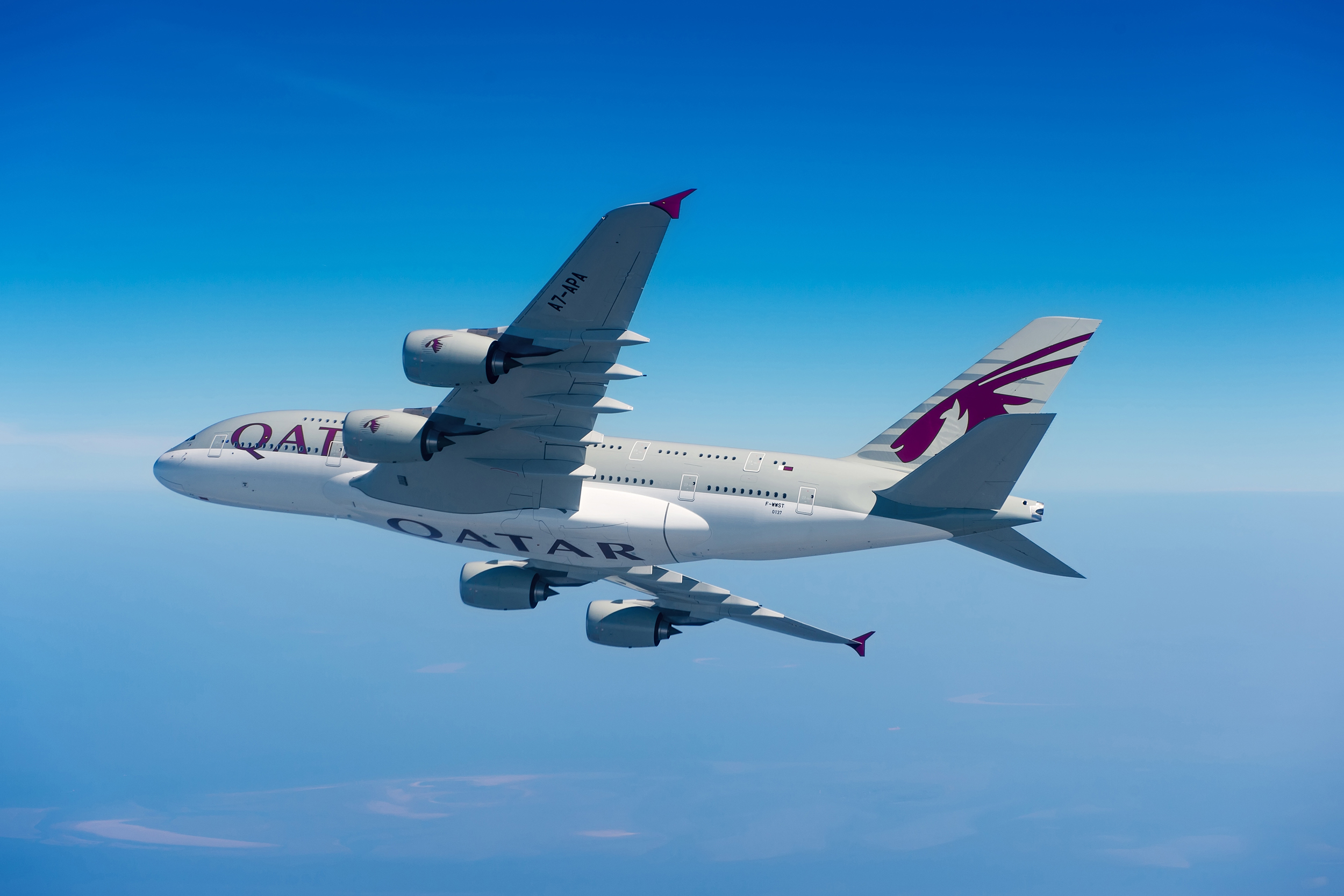
![]() Qatar Airways is another new entry into our Top 10 this year. The judges decided that the grey aircraft with bold graphic burgundy Oryx design were both smart and sophisticated. Now seen on 787s, A350’s and A380’s, this young carrier has a large order book of the newest of aircraft, meaning that most of the latest airframes will be sporting a Qatar livery. The five-star airline has featured the livery since 2006, and even though less than ten years old is one of the most recognized liveries in the skies. Both typeface and logo sit in perfect balance on the aircraft, and the livery works on all shapes of aircraft, from smaller A318s and A380s.
Qatar Airways is another new entry into our Top 10 this year. The judges decided that the grey aircraft with bold graphic burgundy Oryx design were both smart and sophisticated. Now seen on 787s, A350’s and A380’s, this young carrier has a large order book of the newest of aircraft, meaning that most of the latest airframes will be sporting a Qatar livery. The five-star airline has featured the livery since 2006, and even though less than ten years old is one of the most recognized liveries in the skies. Both typeface and logo sit in perfect balance on the aircraft, and the livery works on all shapes of aircraft, from smaller A318s and A380s.
8. [joint] Air Inuit [-4]

![]() Yes, Air Inuit features in our Top 10 yet again this year, quite a feat for such a small regional carrier. This stunning livery is stunning purely due to the environment it belongs in. This bright Escher style graphics emblazoned in orange, against the bleak white environment of Canada where it flies to, is purely genius. The Canadian geese tessellating pattern is almost Scandinavian in design, and has been heralded by design critics around the world as prime example of a successful and complete branding exercise. Designed by Canadian creative studio FEED and the lead Brand strategist Marc-André Chaput, this amazing new look has excelled itself.
Yes, Air Inuit features in our Top 10 yet again this year, quite a feat for such a small regional carrier. This stunning livery is stunning purely due to the environment it belongs in. This bright Escher style graphics emblazoned in orange, against the bleak white environment of Canada where it flies to, is purely genius. The Canadian geese tessellating pattern is almost Scandinavian in design, and has been heralded by design critics around the world as prime example of a successful and complete branding exercise. Designed by Canadian creative studio FEED and the lead Brand strategist Marc-André Chaput, this amazing new look has excelled itself.
8. [joint] Swiss [-2]

![]() In Europe, there is a monotonous sea of Eurowhite carriers featuring large white fuselages, with splashes of colour usually appearing only on the tail fin. The one carrier that really started the trend still stands out against its imitators. The new look Swiss offers a simplified and cleaner version of the original Tyler Brulé design. The logo is, in essence, the national flag; and what could be better for a national carrier? What should also be celebrated is the maintenance of the fleet, their pristine white aircraft constantly looking smart and clean. Mirroring the livery, Swiss has embraced a wealth of well thought-through design elements inside, including glorious and elegant premium cabins. Well done Swiss, for showing how a simple modernist design should be executed.
In Europe, there is a monotonous sea of Eurowhite carriers featuring large white fuselages, with splashes of colour usually appearing only on the tail fin. The one carrier that really started the trend still stands out against its imitators. The new look Swiss offers a simplified and cleaner version of the original Tyler Brulé design. The logo is, in essence, the national flag; and what could be better for a national carrier? What should also be celebrated is the maintenance of the fleet, their pristine white aircraft constantly looking smart and clean. Mirroring the livery, Swiss has embraced a wealth of well thought-through design elements inside, including glorious and elegant premium cabins. Well done Swiss, for showing how a simple modernist design should be executed.
7. Qantas [new]

![]() This is perhaps one of the most iconic airline brands for our antipodean readers. The Qantas ‘Roo’ has been part of the brand since October 1944, and has gone through a few incarnations, including the famous ‘winged kangaroo’ designed by Gert Sellheim. However, since 1984, the livery has remained pretty much unchanged, with only small tweaks to the design in 1995 and 2007. The large red tail with White Roo silhouette and the bold QANTAS logotype are the only simple adornments to an otherwise white aircraft. The best example of the livery is to be found on the A380, featuring the latest and sleekest Roo design by Hans Hulsbosch.
This is perhaps one of the most iconic airline brands for our antipodean readers. The Qantas ‘Roo’ has been part of the brand since October 1944, and has gone through a few incarnations, including the famous ‘winged kangaroo’ designed by Gert Sellheim. However, since 1984, the livery has remained pretty much unchanged, with only small tweaks to the design in 1995 and 2007. The large red tail with White Roo silhouette and the bold QANTAS logotype are the only simple adornments to an otherwise white aircraft. The best example of the livery is to be found on the A380, featuring the latest and sleekest Roo design by Hans Hulsbosch.
6. American [new]

![]() Maybe this is one airline that has just started to grow on us, but, as the fleet starts to get rolled out in the new livery, there are elements to which the judges are really warming. While the tail fin splits the world with a strong love-hate aesthetic, the simple soft metallic paint job and large refreshed and modern logotype and new logo have managed to turn the image of the carrier around. The strong Americana influence to the tail fin is certainly bold, and does a good job of reflecting the ‘New American’ core message of the carrier.
Maybe this is one airline that has just started to grow on us, but, as the fleet starts to get rolled out in the new livery, there are elements to which the judges are really warming. While the tail fin splits the world with a strong love-hate aesthetic, the simple soft metallic paint job and large refreshed and modern logotype and new logo have managed to turn the image of the carrier around. The strong Americana influence to the tail fin is certainly bold, and does a good job of reflecting the ‘New American’ core message of the carrier.
5. Hawaiian Airlines [-4]

![]() Now a regular feature in our Top 10 list, Hawaiian Airlines has one of the most elegant and beautiful airline liveries around. The addition of the Pualani (roughly translated, Heavenly Flower) on the tail has really captured the spirit of the Hawaiian Islands. However, the addition of the leaf motif and of the bright purple and pink colors make it feel exotic and modern. The whole look sits well with the judges, who have celebrated the use of color, design and balance. Just a mere six colors make up the tail design, yet provide an illusion of depth and shade. With the addition of O’hana by Hawaiian, the Hawaiian skies are some of the best to watch if colorful and beautiful liveries are your thing.
Now a regular feature in our Top 10 list, Hawaiian Airlines has one of the most elegant and beautiful airline liveries around. The addition of the Pualani (roughly translated, Heavenly Flower) on the tail has really captured the spirit of the Hawaiian Islands. However, the addition of the leaf motif and of the bright purple and pink colors make it feel exotic and modern. The whole look sits well with the judges, who have celebrated the use of color, design and balance. Just a mere six colors make up the tail design, yet provide an illusion of depth and shade. With the addition of O’hana by Hawaiian, the Hawaiian skies are some of the best to watch if colorful and beautiful liveries are your thing.
4. British Airways [new]

![]() With the introduction of the Boeing 787 and Airbus A380, British Airways is proudly flaunting its new fleet. With the navy lower belly on the massive A380, and its freshly painted Dreamliners, the carrier has refined its livery and, three years ago, renewed its fleet with the re-introduction of its coat of arms. Since early 2008, the Speedmarque and stylised Union Jack have become iconic images associated with the premium carrier. The colors, balance and sense of movement have all brought the carrier into our top 10 list for 2015.
With the introduction of the Boeing 787 and Airbus A380, British Airways is proudly flaunting its new fleet. With the navy lower belly on the massive A380, and its freshly painted Dreamliners, the carrier has refined its livery and, three years ago, renewed its fleet with the re-introduction of its coat of arms. Since early 2008, the Speedmarque and stylised Union Jack have become iconic images associated with the premium carrier. The colors, balance and sense of movement have all brought the carrier into our top 10 list for 2015.
3. Air New Zealand [new]

![]() Air New Zealand has never been shy of its liveries, with special ones to celebrate each of the Lord of The Rings franchise films. However, its ‘All Black’ fern livery is the smartest of all. Still featuring the Koru, the new black and white livery is just a few small changes away from perfection, and the completely black one is certainly the better of the two differing designs found on Air New Zealand’s fleet. Whether we see Smaug or the new livery design at the airport, we always have a smile on our face when we see an Air New Zealand aircraft on stand.
Air New Zealand has never been shy of its liveries, with special ones to celebrate each of the Lord of The Rings franchise films. However, its ‘All Black’ fern livery is the smartest of all. Still featuring the Koru, the new black and white livery is just a few small changes away from perfection, and the completely black one is certainly the better of the two differing designs found on Air New Zealand’s fleet. Whether we see Smaug or the new livery design at the airport, we always have a smile on our face when we see an Air New Zealand aircraft on stand.
1. [joint] Fiji Airways [+1]

![]() Although sadly, we recently saw the passing of Makereta Matemosi, the designer behind the airlines iconic image, Fiji Airways‘ livery climbs the ladder again this year, with its highest ever score. In a similar story to that of O’hana by Hawaiian, this wonderful ‘heritage-bound’ national design that uses pacific tribal patterns and emblems shows a proud cultural image that will stand out at its international destination airports of Sydney, Auckland, Hong Kong and Los Angeles. Conceived by FutureBrand, the design is the end result of great thought and research – and the story of how the livery was pieced together shows the very simple yet elegant design solution. The livery boasts a strong unique logotype, a bold tailfin and intricately decorated nacelles, which draw the eye all over the well-balanced airframe. We are excited to see new aircraft joining the fleet. Airlines like Fiji Airways show that we still are producing wonderful, inspiring liveries even today.
Although sadly, we recently saw the passing of Makereta Matemosi, the designer behind the airlines iconic image, Fiji Airways‘ livery climbs the ladder again this year, with its highest ever score. In a similar story to that of O’hana by Hawaiian, this wonderful ‘heritage-bound’ national design that uses pacific tribal patterns and emblems shows a proud cultural image that will stand out at its international destination airports of Sydney, Auckland, Hong Kong and Los Angeles. Conceived by FutureBrand, the design is the end result of great thought and research – and the story of how the livery was pieced together shows the very simple yet elegant design solution. The livery boasts a strong unique logotype, a bold tailfin and intricately decorated nacelles, which draw the eye all over the well-balanced airframe. We are excited to see new aircraft joining the fleet. Airlines like Fiji Airways show that we still are producing wonderful, inspiring liveries even today.
1. [joint] Etihad [new]
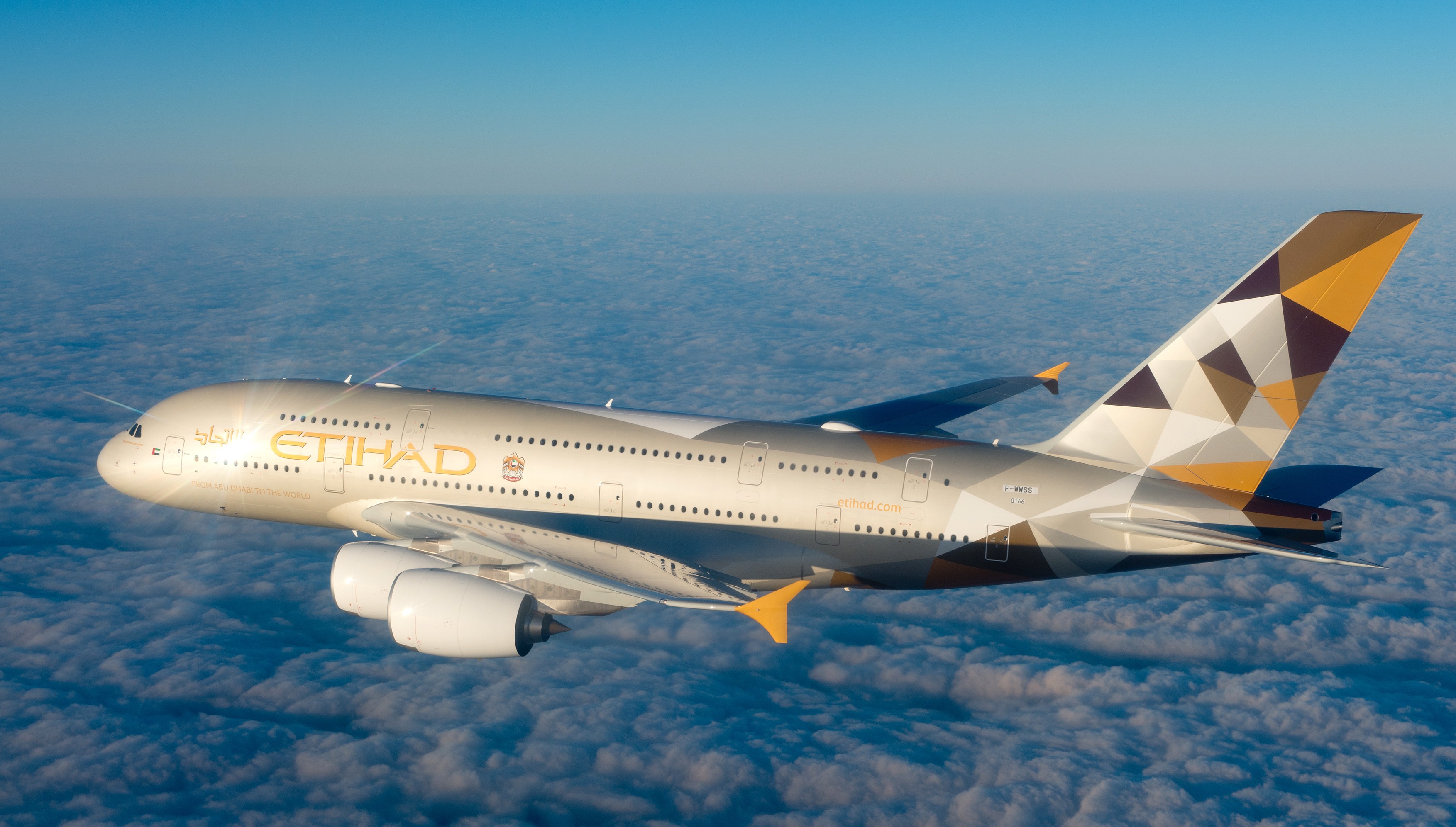
![]() Going straight to the top, Etihad has won over the judges this year with a bold geometric design that matches the new airline brand image. Created by leading brand consultants Landor Associates in partnership with Etihad Airways, the new livery is inspired by traditional Emirati design patterns, the landscapes of the desert and the geometric shapes found in the modern architecture of Abu Dhabi. It is both striking and very contemporary, mirroring the current aesthetic for polygonal design. This is more than just a livery; it matches a combined brand image across all passenger experience touch-points. While the new livery can now mainly be found on Etihad’s A380s and 787s, it will be rolled out across the entire fleet. We can’t wait to see how it will look on such a wide range of airframes.
Going straight to the top, Etihad has won over the judges this year with a bold geometric design that matches the new airline brand image. Created by leading brand consultants Landor Associates in partnership with Etihad Airways, the new livery is inspired by traditional Emirati design patterns, the landscapes of the desert and the geometric shapes found in the modern architecture of Abu Dhabi. It is both striking and very contemporary, mirroring the current aesthetic for polygonal design. This is more than just a livery; it matches a combined brand image across all passenger experience touch-points. While the new livery can now mainly be found on Etihad’s A380s and 787s, it will be rolled out across the entire fleet. We can’t wait to see how it will look on such a wide range of airframes.

It just dawned on me why KLM decided to lower the start of the cheat line: to accommodate the lower nose on the 787 and A350 so that the blue and white meet perfectly in the middle. I thought it looked rather awkward on the 737, 777, 747, etc. because the previous livery achieved perfect symmetry on their noses, but at least this makes sense now.
I just realised that as well. That’s why the old livery on their E-190 looks a bit out of place.
I think Aerolineas Argentinas, and also Avianca, really deserve a place in this list, as they feature really nice and renewed liveries that stand out in that part of the world.
Wholeheartedly agree, both airlines made excellent use of curves and color to add a tasteful design to their liveries.
Swiss? seriously???
And where is Air Malta? 🙂
I still don’t get the idea behind KLM ‘new” livery. The Etihad livery is fantastic, bold and refined at the same time. although it looks better on the 787 and A321 than on the A380. And I wish BA would use its coat of arms on the tail too.
What about Finnair? Minimalistic but contemporary and stylish.
How did AA even make this list?
FutureBrand worked with AA for a good portion of 2012 to develop “New American” and they unveiled it in January of 2013 after FB handed AA’s Branding department the graphic design handbook. For the next 8 months, AA would run into a large number of problems.
1. FB ignored to test logo applications on cloth, glass, and porcelain. This wasn’t figured out until months after the unveiling.
2. The handbook AA received was incomplete, disorganized, and, for example, changes had to be made on certain spacial dimensions of the logo and text (an EXTREMELY basic section of any handbook).
3. The design firm approved and explored options for grey paint without doing any research on sticker residue with the gloss chosen for the color (this led to issues on multiple aircraft, resulting in additional costs to make stickers with special adhesive).
4. FB didn’t adequately do market testing of the flag tail before pitching it to Horton’s team. The result was 30% of the employees actively voting against it and was nearly removed in a 48-52 vote.
Those numbers are far from successful, let alone the worthiness of any “best” list. The survival and appreciation of brands should be through their quality and positive reception, not their “luck.”
AA’s brand is a result of “because the other guys exited bankruptcy with something similar” mentality, headed by a corporate team with less knowledge of the subject than they thought, and was developed at the hands of a lazy design team which lacked the vision for even the most basic of details.
TL;DR: AA was given a lemon by FutureBrand and was told to make lemonade.
Simple, because the new AA livery looks good
I still love the Air Canada livery…they have lightened the colour up quite a bit from what was originally proposed – I remember seeing the original 767 and it was quite bold (more like a darker turquoise). I love how it changes colour in different lighting conditions and that shimmery pearl finish.
I’m not a fan of KLM’s newly dropped cheat line, though I suppose I’ll get used to it. Frankly, I thought they were one of the few airlines that did NOT need a livery update. As for Swiss and Qantas making this list, I’m surprised. Their liveries are fine, but they certainly don’t turn my head at airports.
Might have missed out Garuda Indonesia’s livery, which I think is one of the other oustanding re-branding exercise!
I’m really surprised to see Ethiad at #1. Diamonds are ok I guess but it needs some curves to balance the whole thing. ANZ, the leaf competes with the Koru design for attention. That new American look just makes them look old. Why isn’t Air Tahiti Nui or Air Sheychelles on here? How about China Airlines?
American Airlines with that tail that looks like a piano? Really? Aerolineas Argentinas should be on that list, just beautiful…
It’s a modern new look! It’s one of the most original and unique representation of the flag I’ve seen.
I think Aerolineas Argentinas is one of the nicest right now… So I don´t agree with this tanking.
Come on what about Caribbean Airlines????
Africa, Latin America and the Caribbean and the Indian Subcontinent, Central Asia And Southeast Asia were slighted. i.e.: Air Niugini, Vietnam Airlines, Thai Airlines, South African Airways, LAN, Air Asia (Taylor Swift), Indian Airways, Air Jamaica and AepoCbit. Swiss has good branding, but is too plain.
Garuda Indonesia?
Qatar Airways livery is brilliant. Very distinctive and eye-catching. Air New Zealand, the same. Nice one, Kiwi’s. Etihad’s livery just confuses me, but it might grow on me. The notes have certainly helped. Having never been to Abu Dhabi, I don’t yet appreciate its significance, but I’ll google like crazy. Awesome shapes and colours though. In fact, I really like all these liveries. However, Qantas takes it up to the next level, and I say that for one reason, and one reason only – it screams it’s country of origin like very few national carrier’s liveries do. Show that logo to any child on earth and they will recognise it as Australian. They may not know the carrier name, but they will recognise the animal, and they know where Kangaroos come from. I think it’s one of the most “iconic” brands in the industry. All that aside, the big red tail and white roo stands out at any airport. Oh, and thumbs up to Air Inuit. Very cool.
How about Air India ? The tail has the wheel like structure and Vietnam airlines too looks good.